

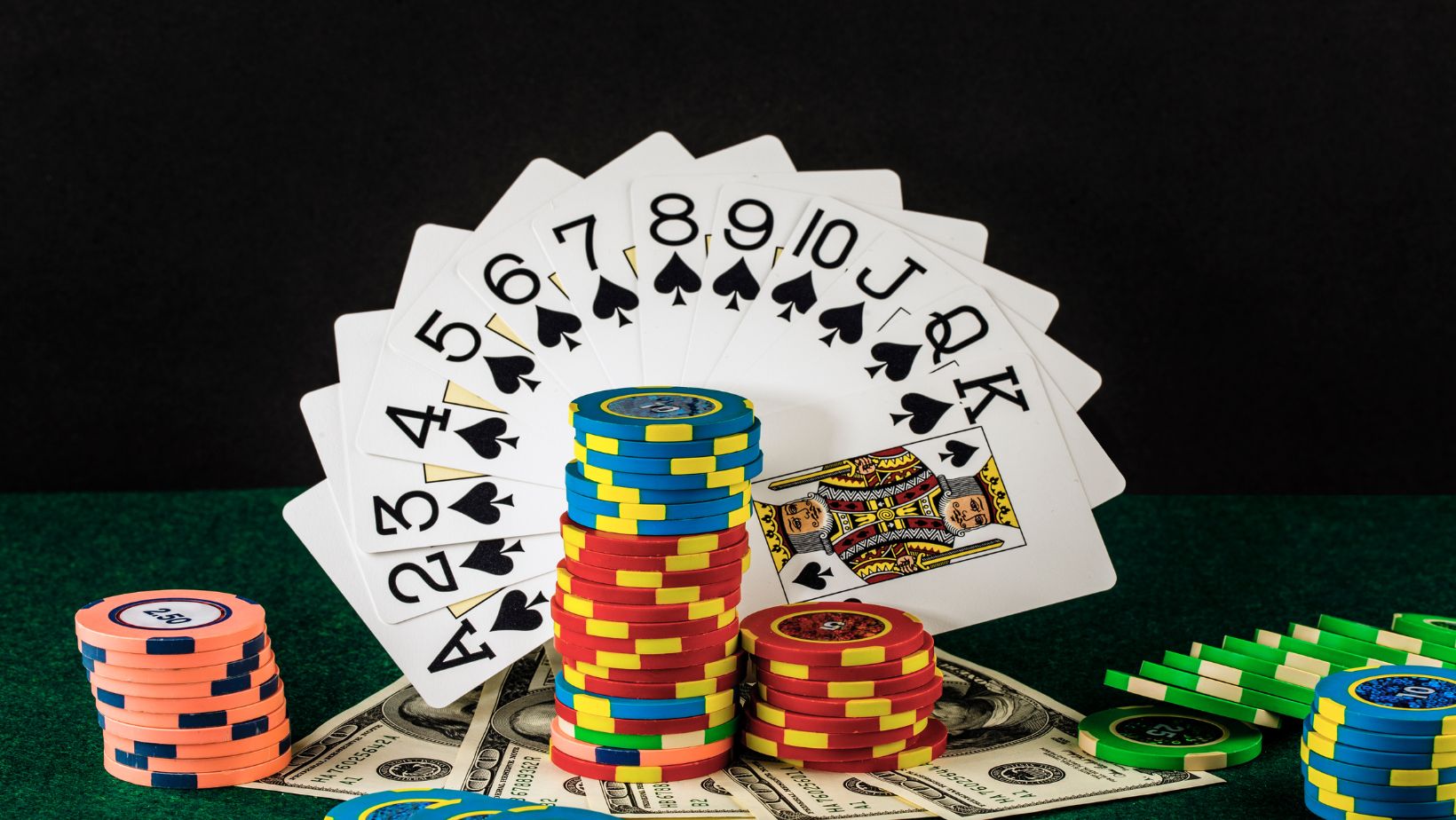
Whether you are an experienced designer or new to the biz, online casino game logos can be tricky, with many factors to bear in mind. So, to make things a little easier, here are a few key things to consider.
Take Inspiration From Relevant Imagery
Many online casino games take their inspiration from broad, overarching themes such as Ancient Egypt or Irish mythology. However, some games have a more niche inspiration, such as a specific TV show, sport, or game. For example, the rules of the slot Plinko Go come from the Plinko pricing game on the TV show The Price is Right, which has been gracing our screens for decades. With this in mind, it is important for inspired media such as Plinko Go to incorporate imagery, icons, and motifs that communicate the game’s identity, origins, and history, as this will make it recognizable to players browsing the game listings.
With this in mind, the traditional Plinko board and its reproductions are rounded, with stripes emanating from either side. The digital logo for the game uses royal blue, magenta, and cyan and also incorporates stripes and circles accordingly. Plinko Go takes a similar approach with its logo, featuring a segmented circle of blue and magenta gradients, with a spotlighted outline to indicate the game show origins. In doing so, this immediately portrays the gameplay while also establishing a distinct identity away from its inspiration.
Don’t Underestimate the Power of Typography
Typography has the power to make or break a logo design. One of the most famous typography hiccups of all time can be seen in the Avatar logo, which contributed to an iconic SNL sketch about the designer’s choice to use the free, commonly used font Papyrus! The choice received so much backlash that they changed the typeface for the sequels—such is the power of good typographical design.
The first thing to remember for online casino games is that they will often be displayed on a small scale, particularly when played on smartphones. This means that there has to be a payoff between creativity and readability.
On the one hand, it needs to reflect the tone and thematics of the game but also be legible. For example, for games inspired by Ancient Greece, a linear, angular, geometric font is a good choice, but be careful to steer clear of more complex fonts with lots of ornaments and embellishments, as these will be harder to read.
Keep it Simple and Concise
When designing a logo for an online casino game, you’ll likely have found that there is a fine line between too much and too little. A logo that is ‘just right’ can convey the branding as simply as possible without the logo becoming too busy, but also have enough elements to portray the energy of the game. This might be easier said than done – some of today’s most recognizable logos have evidence of this.
Just look at Starbucks, for example. The logo began with a very detailed sketch of a siren with two tails. The design was first simplified in 1987 and again in 1992. By 2011, they had removed any text using a simple white vector over a green background. This logo creatively communicates the branding without making it too complex for audiences to understand.
And there you have it – just a few key considerations for online casino game logo design. With these things in mind, it’s time to get started designing a memorable logo.