
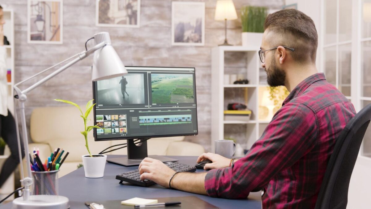

A logo in a video acts as a quiet brand signature: it shouldn’t shout from the screen, but should help the viewer quickly understand who’s speaking, demonstrating, explaining, or offering a product. When a video is created directly in the browser using a video maker, a logo can be added without heavy editing, complex software, or time-consuming preparation, especially if the file already exists in PNG format with a transparent background. This approach is convenient for short promos, reviews, instructions, presentations, Reels, Shorts, and website videos.
Why a logo in a video is more important than you think
Videos often exist separately from websites, profiles, or advertisements. They’re shared via messengers, embedded in articles, downloaded, posted to stories, and cut into short fragments. In these situations, the logo becomes a small anchor: it connects the video to the brand even when the viewer sees it outside its usual context.
This is especially important for small businesses, experts, local services, online stores, and bloggers. They don’t always have a large advertising campaign, but they do have the goal of making their visual style gradually memorable.
The logo in the video helps:
- secure content authorship;
- make the video more visually cohesive;
- maintain a consistent brand style;
- carefully protect materials from copying without indicating the source;
- make an advertisement, instruction or presentation more professional.
The main rule: a logo should enhance recognition, not interfere with viewing. If the viewer only notices the logo, it’s already too active.
Where is the place to place a logo?
A logo in a video has several possible uses. The choice depends on the video’s format and how prominently the brand needs to be displayed.
1. At the beginning of the video
A short intro with a logo is suitable for presentations, training videos, corporate videos, and YouTube content. But it should be really short. If the intro is 6-8 seconds long, the viewer may leave before the main part.
A good option is 1–2 seconds: a logo, a short slogan or project name, then immediately transition to the content.
2. In the corner of the screen
This is a watermark format. The logo is constantly present in the frame without stealing the spotlight. This option is suitable for reviews, podcasts, tutorials, production videos, expert commentary, and short videos for social media.
The top right or top left corner works best. The bottom of the screen is often occupied by subtitles, interface buttons, product descriptions, or important frame details.
3. In the final
A final screen with a logo is a great way to end a video. You can add a website, a short call to action, a QR code, or contact information. This format is especially useful for video ads, promotions, portfolios, and service presentations.
4. Inside the stage
Sometimes a logo can be embedded into the video itself: on packaging, a sign, a laptop screen, a presentation background, a badge, or a caption. This technique looks more natural than a large logo overlaying the frame, but requires more precision.
How to prepare a logo for a video
For video, a PNG logo with a transparent background is best. It can be easily overlaid on the frame and doesn’t create a white rectangle around the logo. A JPG logo can also be used, but it tends to look harsher, especially against a colored or dark background.
Before adding a logo to a video, there are a few things to check:
- the file must be in good resolution;
- the background must be transparent;
- the sign must be legible in small size;
- It is desirable to have a light and dark version of the logo;
- There should be some free space around the logo.
If a logo is difficult to read in a video, the problem isn’t always with the symbol itself. Sometimes, adding a light background, changing the placement, or using a monochrome version is enough.
The history of design is full of examples of logos that became powerful precisely because of their simplicity and recognizable form. For example, consider the history of the Wikipedia logo: the symbol itself is built around a clear idea of global knowledge, not decorative complexity. The same principle applies to video—the viewer must quickly comprehend the image, not decipher it.
How to avoid overloading your video with branding
The most common mistake is trying to put the logo everywhere: at the beginning, in the corner, in the background, in the credits, and even at the end. As a result, the video starts to look less like useful content and more like a banner that accidentally came to life.
Branding should be measured, especially if the video is short. For videos lasting 15–30 seconds, one of two options is usually sufficient:
- a small logo in the corner throughout the video;
- logo at the end plus brand color in text or graphics.
For a longer video, you can use a combination of a short intro, a neat watermark, and an ending screen. However, all elements should be consistent in style.
A useful guideline: even if you remove the logo from a video, the video should still look cohesive. A logo adds a sense of authorship, but it’s no substitute for good structure, clear text, and proper editing.
A practical script for a simple branded video
Let’s say you need to make a short video for a company: showcase a service, add a few phrases, music, and a logo. You don’t necessarily need to start with a professional studio. You can create a basic version right in your browser.
An approximate structure could be as follows:
- First shot:
A short phrase that immediately explains the essence of the video. For example: “How to prepare an office for renovation without interrupting operations.” - Main body
: A few shots: process, team, result, details. Here, the logo could be placed in the corner, but make it small and translucent. - Text inserts:
2-3 short bullet points. It’s best to avoid long sentences, as viewers watch videos quickly and often without sound. - Final screen
Logo, website, short call to action: “See examples of our work”, “Submit a request”, “Save the instructions”. - Export for the required platform:
For a website, a horizontal format is suitable, for Reels and Shorts – vertical, for presentations – usually 16:9.
Such a video doesn’t have to be complex. On the contrary, simple videos often work better: viewers understand the message more quickly, and the logo doesn’t get lost among unnecessary effects. Using an AI video editor can help simplify the editing process while maintaining a professional and polished final result.
Common mistakes
Even a good logo can be ruined by improper use. Here’s what to check before publishing:
- The logo is too large.
It obscures part of the frame and irritates the viewer. - There is no transparent background.
A white or black rectangle appears around the sign. - Poor contrast.
A light logo stands on a light background, a dark logo on a dark background. - There’s too much animation.
The logo jumps, flashes, spins, and distracts from the video’s message. - Different versions of the brand in one video.
One logo at the beginning, another at the end, the colors mismatched, the font random. - The logo is positioned over important information.
It obscures a person, product, text, interface, or subtitles.
Result
A logo in a video isn’t just decoration. It’s part of a brand’s visual memory. It helps viewers connect the video with the company, creator, product, or project. But it only works when it’s carefully integrated: in the right place, at the right size, with the right contrast, and without being obtrusive.
For most tasks, a simple set is sufficient: a PNG logo with a transparent background, a clear video structure, short text inserts, and a clean final design. This ensures the video looks put together, the brand remains recognizable, and the viewer doesn’t feel like they’re being shown an ad for the sake of it.
