
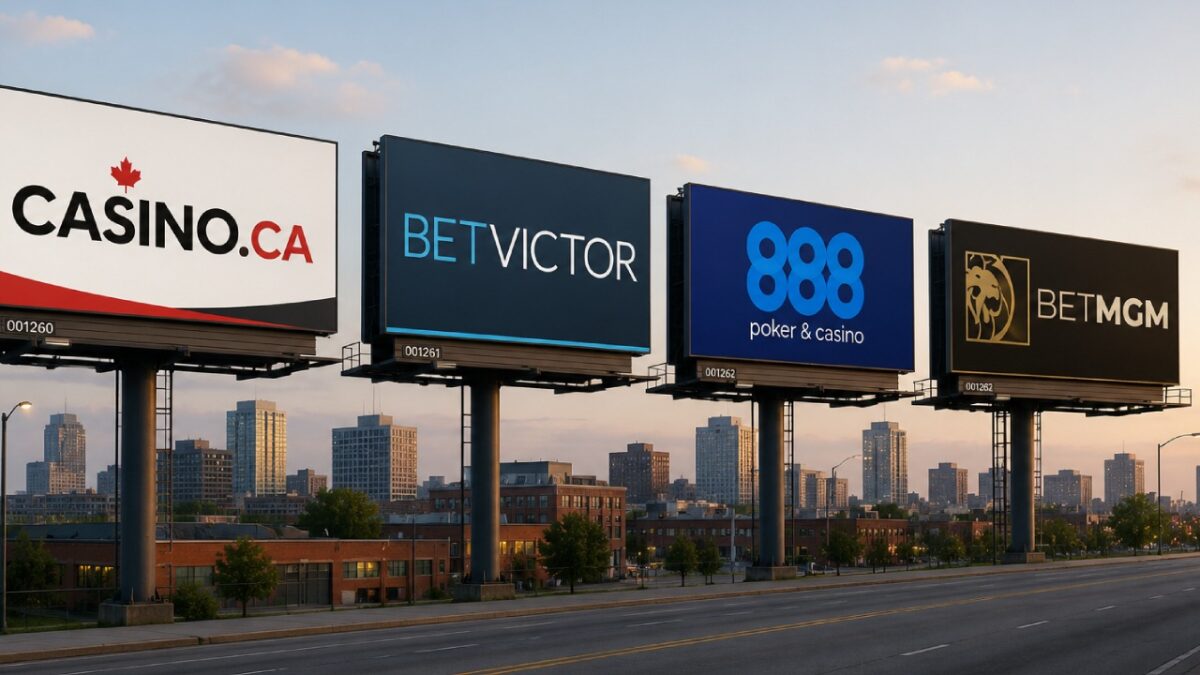

The world of online gambling web design has changed a lot in the past few years. Where gambling once had its own set of signifiers and a unique aesthetic, from the logos to the color schemes and the user experience, this has evolved with the times. Today’s gambling brands, while they use elements of the classic Las Vegas-inspired heritage, look to communicate trust, familiarity and entertainment over traditional gambling designs.
These four brands represent a cross section of the sector. While three of them offer similar selections of games and bonuses, they each have different strengths to their visual identities that appeal to a subtly different kind of online gambler. This is how those messages woven into the design choices of four online gambling sites, from the logos to the color schemes and the font choices.
1. Comparison Site Casino.Ca – Simple, Straightforward and Local
Casino.ca is a comparative resource for online gamblers. It doesn’t offer real-money gambling itself – instead it provides the information and expert analysis for Canadian players to assess the casino and betting options relevant to their local or national market.
Their logo is a casino chip with a red Canadian Maple Leaf in the middle. This tells you immediately what the site is about and who it is targeting. That goes along with the .ca in the domain name and the site’s actual name.
The minimal design choices from the iconography of the logo to the white background and cool greens boxouts, reflect professionalism and transparency. The site isn’t trying to entertain visitors – it is is giving them information.
2. BetVictor Uses a Professional Color Palette for a Sports Focus
BetVictor is a European-based but globally operating brand that focuses on sports betting, but also has a comprehensive casino section.
The BetVictor logo is simple – just the name in a sans serif font with clean lines. One part in cool blue and one in white, usually on a grey background. Clear, professional and no-nonsense. As a name it has some intrigue, because it could be interpreted as Victor for “victory” or winning a bet. But also Victor is a well known name in Europe and elsewhere.
Outside of the logo BetVictor is clearly aimed at experienced, discerning bettors. It has a lot of options packed into the site sidebar, which any experienced gambler knows is usually a good sign, but it doesn’t try to over stimulate or pack in images of people having fun. For example, the sole image on the BetVictor homepage usually is a non-descript action photo of a sport. Most often soccer. Simple, clean and professional UX web design.
Some might think this is boring, but to many bettors it means clean professionalism and is actually a signal of trust.
3. 888 Casino is One of the World’s Classic Gambling Brands for a Reason
888 is a massive global betting brand (although the main umbrella company is now known as evoke plc). It has been a consistent industry heavyweight for decades. 888 is a Chinese symbol of good luck and fortune, which many gamblers will know and recognize.
It also makes a visually appealing logo, with something about the repeating symbol being pleasing to the eye.
The modern version of 888 casino’s logo has the three green 8s overlapping each other slightly, creating light and darker patches, which keeps things visually interesting without being gaudy. It is usually displayed on a black background for maximum contrast.
888’s homepage design reflects the bold and memorable logo choice, with bright colours, animated content and visuals of people and croupiers or dealers having fun at a casino.
While this is old-school design ethos now, it appeals to a certain kind of player – and it has definitely been toned down for modern audiences. It also clearly positions the brand differently in a market where many opt for the professional, minimal sportsbook look to be familiar.
4. BetMGM Uses the Classic Vegas Aesthetic but Nicely Modernized
BetMGM is jointly owned by America’s largest physical casino operator and Las Vegas-based giant MGM Resorts International. This is a hugely well known brand in the US and globally, due it’s historic associations with 1960s glamour and Hollywood and it’s massive resort casinos.
The online venture is relatively new for the long-standing company having only launched in 2023. Therefore it trades heavily on that legacy. And why would you not?
The BetMGM logo features the iconic roaring gold lion, updated into modern iconography with a muted, burnished gold colour. Next to it is the name of the company in an italic font with BET in white and MGM in gold. Iconic. Luxury.
Outside of the the logo, the design choices stick to the muted gold and deep black theme. While there is certainly more excitement than at BetVictor, it isn’t as energetic and playful as 888. Somewhere in between – which reflects the Las Vegas heritage of the brand, while keeping it sophisticated and modern.
It even has widescreen photos of the Las Vegas Strip subtly shadowed into the background, to fully trade on it’s longstanding brand strengths.
