Why Visual Hierarchy Leads Mobile Design Success
Crafting successful mobile experiences relies on much more than fitting content onto a small screen; it’s about guiding users through each interaction using a clear visual hierarchy in mobile interfaces.
This principle should anchor every design project from the start because it ensures that logos, navigation menus, as well as call-to-action elements all stand out, while supporting the brand’s identity and its usability.
Designers can arrange elements inside mobile interfaces through visual hierarchy for showing to show users each interface part’s importance that is relative importance.
Hierarchy is established, with order brought, clarity improved, on mobile screens where space is limited.
Hierarchy makes a flow, and distractions rise from the first glance to the last tap.
Establishing Visual Hierarchy: Core Elements
A well-organized visual hierarchy happens because core design elements like size, color, spacing, and position are working together to guide attention.
These instruments let users know the next steps, recognize brands right away, and navigate with no effort.
These tools are therefore helpful if used correctly.
- Size: Larger elements get attention first, making critical features like a logo or main button easy to spot.
- Color and Contrast: Vibrant colors or high-contrast accents quickly highlight interactive sections and important information.
- Typography: Bold headers and varying font sizes create easy-to-follow reading paths, especially for key brand statements.
- Spacing and Proximity: Adequate white space separates sections, clarifies grouping, and prevents clutter.
- Position: Placing priority items high on the screen and near navigation zones leverages natural scanning instincts, ensuring brand assets and key features appear first.
Designing for Brand and Clarity
Mapping out what matters most for a mobile audience starts with good visual hierarchy.
Eye-catching logos as well as top-placed main actions follow supportive navigation plus brand details.
Minimalist design further lets primary elements shine since it focuses users on what’s important.
Uncluttered layouts can make platforms more usable as well as reinforce a professional identity when you are offering logos or brand tools.
Users happen to be able to instinctively progress ahead from primary calls-to-action on down to secondary content for when a clear reading order is indeed established.
Consistent visual signals cause this establishment to happen.
Sizable critical touch targets are separated because they support aesthetic clarity and practical accessibility.
Vertical-First and Responsive Principles
A mobile-first approach isn’t just about screen sizes; it’s about vertical flows guiding the eye.
Help for users is to scroll along toward deep content that starts with the elements of highest priority.
Responsive layouts permit brand assets as well as navigation for adapting to any device or orientation while maintaining a consistent hierarchy plus usability.
People like sticky navigation, people like floating action buttons, people like thumb-friendly placements, but clear visual hierarchy impacts their use.
If primary paths are visually reinforced, users can move between sections without confusion.
Users will be helped by visually reinforcing paths.
Minimalism and Focused Interface Structure
Visual hierarchy thrives when you reduce clutter in it.
Whitespace is to be used as a device that supports brand recognition by highlighting important features.
Because they allow the brand logo and key interactive elements to dominate without distraction, the best mobile interfaces separate actions and information.

Hierarchy is reinforced through visual cues such as repeating patterns as well as consistent color schemes.
Designers balance repetition along with variety to keep interfaces dynamic.
This balance makes interfaces predictable, too.
Seamless Navigation Patterns
Strong hierarchy guides visual attention with the addition of navigation behavior.
Menus, tabs, also buttons should clearly indicate importance through the strongest treatment for primary navigation.
A quieter style is used by actions secondary or contextual.
Consistency in icons, colors, and active states across screens builds user trust.
Touch areas must remain large enough for easy interaction since they need ample spacing that is for the prevent overlap or error, which supports both usability and accessibility.
Accessibility and Inclusive Hierarchy
Proper visual hierarchy benefits every user; likewise, this helps users who show visual, motor, or cognitive differences.
Clearly separate navigation zones with scalable text, maintaining high contrast.
To ensure they get noticed, the most important interactive elements should be prominent visually and also functionally.
This prominence works to avoid confusion and supports all of the user groups.
Real-World Testing and Refinement
Actual users must validate any hierarchy prior to its completion.
Gathering feedback on clarity as well as ease of use early, prototype designs, and also being ready to adjust typography, color, or spacing to improve flow.
Experiences that are truly intuitive for mobile are a result of iterative design.
Iterative design relies on user feedback.
Personalization and Brand Impact
Personalization now plays a role within mobile interfaces, adapting preferences and hierarchy based on user behavior.
Brand engagement, along with utility, can be reinforced by customizing spotlight elements or suggested actions for returning users.
This is especially valuable on platforms that feature branding tools or logos, because users appreciate fast access to their assets and services.
Advanced Techniques and Inspiration
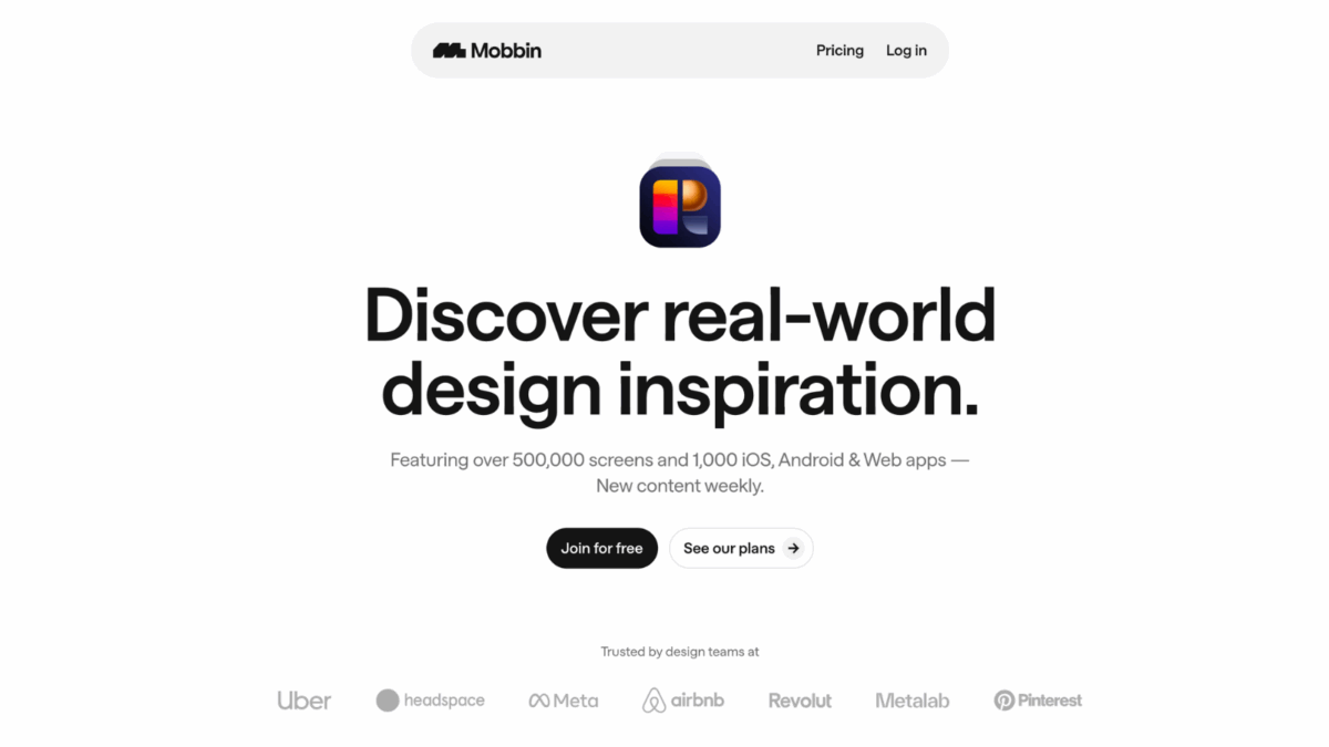
Designers are able to reference leading industry platforms such as Mobbin in order to inspire themselves by way of successful mobile interface patterns.
One overview of the main designs displays the visual hierarchy actually working.
A review such as this one also sparks some ideas for the strengthening of designs in the future.
Keys to Memorable Mobile Experiences
- Anchor every interface with a strong visual hierarchy in mobile interfaces.
- Use size, color, spacing, and positioning strategically to spotlight critical elements.
- Prioritize key brand assets high on each mobile screen.
- Leverage responsive and vertical flows for seamless navigation.
- Open up layouts with generous whitespace and minimalist cues.
- Clearly differentiate primary navigation for easy taps.
- Maintain accessibility through scalable fonts and clear contrasts.
- Regularly test and refine hierarchy with real users.
- Personalize key sections to build brand loyalty.
- Draw inspiration from tools like Mobbin to perfect hierarchy and usability.
Looking Ahead
Mobile interface design continues to advance, yet the visual hierarchy’s core principle still satisfies users and makes brands succeed.
Platforms offering logo tools or branding assets stay ahead by arranging elements with precision.
These platforms do deliver consistent, memorable experiences upon each device because they guide users without effort and test for real-world usability.