In the bustling world of e-commerce, logos do more than just sit pretty on a website. They embody a brand’s identity, values, and even its mission. When we think about Shopee and Lazada, Malaysia’s reigning cats of online shopping, their logos do more than just look good: they tell a story. Today, we’re diving into a comparative analysis of their logos, sharing insights about what makes these symbols tick and what they say about each platform. Spoiler alert: you’re in for a visual treat.
Shopee And Lazada Logo: A Comparative Analysis
We’re all familiar with Shopee and Lazada, two leading e-commerce platforms in Southeast Asia. Both platforms have become household names, providing consumers a vast array of products ranging from electronics to household items. While Shopee is known for its engaging user experiences, complete with fun flash sales and interactive features, Lazada prides itself on a streamlined shopping journey and a solid logistics infrastructure. It’s this fierce competition that not only fuels innovation but also creates a unique aesthetic that reflects each brand’s essence.
Understanding these elements can help us appreciate their logos beyond aesthetic appeal.
The Significance of Logos in E-Commerce

Logos are more than just eye candy. They represent the core of a brand. In e-commerce, where competition is fierce and choices are abundant, a powerful logo can be a cornerstone of brand recognition. Think of it as the visual handshake we offer to consumers. A well-designed logo fosters trust, reinforces brand loyalty, and helps us stand out amid the sea of competitors.
When we see the Shopee or Lazada logo, we don’t just see shapes and colors: we see their brand stories. So, understanding the psychology behind these designs gives us critical insights into each platform’s strategy and identity.
Shopee Logo Design Elements

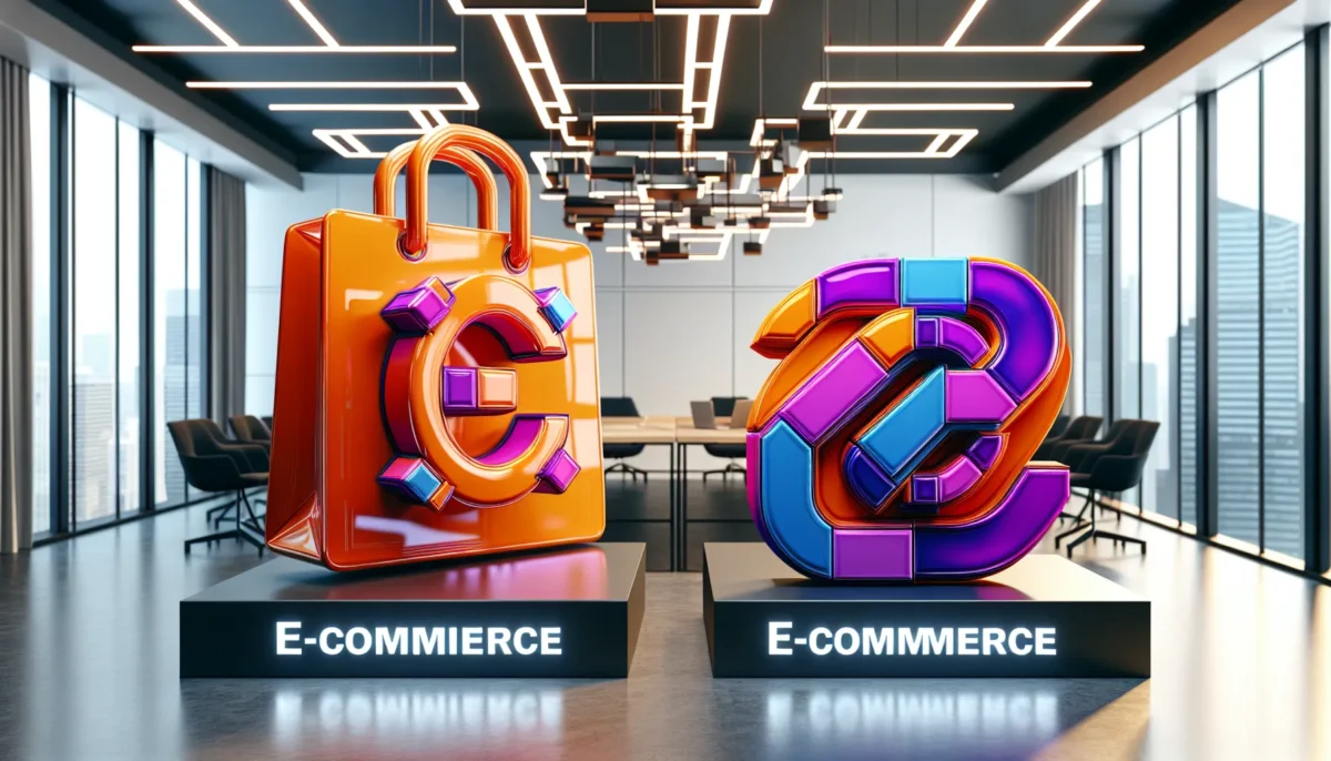
Let’s dissect the Shopee logo, shall we? Its simple yet vibrant design uses a lively orange color, symbolizing enthusiasm and playfulness. The logo features a shopping bag, which instantly connects to its core identity as an e-commerce platform. This choice of imagery signifies convenience, inviting us to imagine a world where shopping is just a click away.
The font is rounded and approachable, creating a sense of friendliness. It invites users to engage rather than intimidates them, the perfect balance for a platform aimed at the everyday shopper. In essence, the Shopee logo embodies a fun, inviting shopping experience.
Lazada Logo Design Elements
Switching gears, the Lazada logo steers us in a slightly different direction. Featuring bold colors like purple, orange, and blue, it exudes a sense of modernity and professionalism. The overlapping letters in the name create a sense of unity and inclusiveness, suggesting that Lazada caters to everyone.
Also, the logo’s sharp, angular font contrasts sharply with Shopee’s rounded letters, signaling a more formal approach to e-commerce. The design seems to say, “We mean business.” It appeals to users looking for both quality and reliability, positioning Lazada as a trustworthy option for serious shoppers.
Comparison of Shopee and Lazada Logos
When we lay the two logos side by side, differences jump out at us, revealing unique brand identities. While Shopee employs a playful approach with its rounded elements, Lazada opts for a more structured, serious aesthetic. The explosion of colors in Lazada’s design contrasts sharply with the singular orange focus of Shopee.
What about impact? Shopee’s logo screams approachability while Lazada’s demands respect and attention. Each logo is a visual shorthand for what we can expect from the platform, fun and engagement from Shopee, and reliability and quality from Lazada. These differences are crucial, as they cater to varying consumer priorities and shopping philosophies.
User Perception of Logos
User perceptions are fascinating and can vary widely based on personal experiences. Shopee’s logo often resonates with younger audiences who appreciate its vibrant energy. On the other hand, Lazada appeals to consumers seeking a more sophisticated online shopping experience.
Through surveys, we see how individuals associated Shopee with fun campaigns and a casual shopping experience. Lazada frequently gets linked with efficiency and reliability, vital for serious purchases. These perceptions can heavily sway our purchasing decisions and brand loyalty in the fast-paced e-commerce environment.