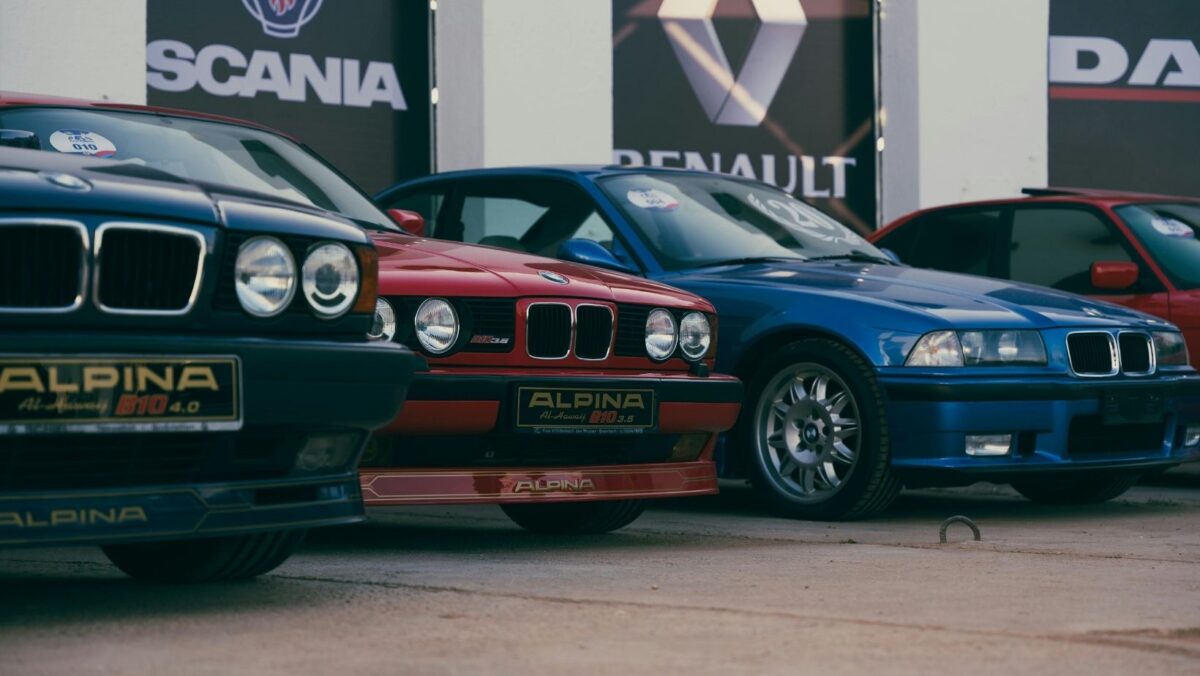
BMW has updated its Alpina brand identity with a fresh new logo. The circular logo is now a part of their brand and was implemented in January 2026. The new badge removes the traditional shield and features a high-contrast, precise look that embraces both minimalism and premium aesthetics.
Contrast Improves Visibility while Aligning with Brand Values
High-contrast logos don’t just remove distractions, as they also carry a lot of visual weight. By adding contrast, designs stay readable but also create depth and excitement. Netflix’s branding, for example, features a red “N” on a black background, with a refined tone that helps to create a cinematic feel, which represents the brand well.
Apple’s monochrome logo is also an example of how colors can be used to suit a brand’s intention, positioning the company as being high-end, sleek and luxurious. Creating branding that suits the brand is essential to how people perceive the brand value.
This is especially important when creating a brand that is connected to a parent brand. The BMW Alpina brand is now incorporated into the wider BMW brand but is made distinct by its luxury black and white branding. This is also seen with digital brands. For example, in the entertainment sector, the Sky Vegas slots offering of Vegas-themed games and the use of these aesthetics make the brand distinct from the wider Sky brand. This creates a distinct brand indentity that ultilises asethetics traditionally connected to Vegas casinos, so the consumer is clear what the brand represents.
BMW’s Alpina logo uses this concept, yet ensures that everything is very much aligned under the BMW umbrella. As BMW looks to future-proof their brand, moves like this not only ensure that their imagery looks good on mobile devices but also ensure that the premium look comes across on their automobiles.
Key Changes to the Alpina Logo
Some of the key changes we have seen to the Alpina logo include a new circular design, which aligns the logo with the BMW range. It’s also possible to see more internal elements, including a throttle and a crankshaft. With that said, they’re simplified, which helps to support a more updated brand image.
Interestingly, the wordmark has also been updated. It’s a subtle nod to the 1970s, which helps to blend the past with the future for the brand. As time goes on, more and more people are aligning with the fact that less is more. The fact that the company has gone with a more premium perception, with the monochrome branding, is certainly indicative of this trend.
BMW is looking to improve brand recall while aligning with some of the wider trends we are seeing in the logo design market. Luxury is becoming synonymous with monochrome color schemes, and simplistic designs are becoming more common. A good example here would be Prada, which again has taken steps to embrace minimalism as a way to stand out in the competitive world of fashion.
With social media allowing people to view hundreds of logos a day through posts, reels, and news updates, it’s a bold move from BMW to adopt a more minimalistic approach. Phone screens are also becoming brighter, so brands that adopt highly contrasting or monochromatic color schemes can expect to see bigger and better results as time goes on.