
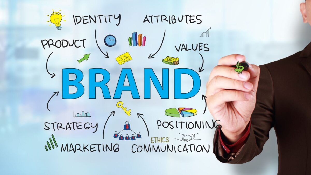

In 2026, businesses face a branding contradiction. They need to publish more content across more channels, often with help from templates and artificial intelligence, yet audiences are increasingly sensitive to generic visuals, inconsistent messaging, and experiences that feel automated rather than human.
That is why brand identity design now matters far beyond the logo. A modern identity must remain recognizable across websites, mobile apps, social media, presentations, physical products, customer support, automated content, and interactive tools. It needs enough structure to create consistency and enough flexibility to work in changing environments.
Consider a specialized digital product such as the shuffle monthly bonus calculator on Fair Gambling. Adults comparing casino promotions can use the tool to examine estimated bonus value before depositing, while designers can observe how labels, inputs, visual hierarchy, qualifying information, and clear caveats help communicate a complicated service. The subject is highly specific, but the branding lesson applies to almost any business.
A memorable brand is not a collection of attractive assets. It is a coordinated system that makes an organization easier to recognize, understand, and trust.
What Brand Identity Design Really Means
Brand identity design is the process of translating a company’s purpose, positioning, personality, and values into visual and verbal elements.
Those elements may include:
- A brand name
- Logo design
- Color palette
- Typography
- Photography
- Illustration
- Iconography
- Brand voice
- Messaging
- Taglines
- Layout systems
- Templates
- Brand guidelines
The work is both strategic and creative. Before a graphic designer selects a font or sketches a symbol, the business must understand what it represents, who it wants to reach, and why customers should choose it.
An effective identity answers practical questions.
Who is the target audience? What problem does the business solve? Which qualities should people associate with it? How should it differ from competitors? What should remain consistent as the organization grows?
Without clear answers, even a polished visual identity can feel disconnected from the business behind it.
Brand identity is more than a logo
A logo is an important brand identifier. It gives people a symbol, wordmark, monogram, or emblem they can associate with an organization.
However, a logo cannot carry the whole identity by itself.
Imagine a company using an elegant serif wordmark on its website, bright cartoon graphics on social media, formal corporate language in emails, and a completely different color palette in its app. Each choice might be attractive independently, but the combination creates uncertainty.
Strong brand identities make those choices deliberately. The logo, typography, imagery, colors, messaging, and digital behavior reinforce the same personality.
Visual and non-visual identity
Visual identities include everything people can see, such as logos, colors, fonts, photographs, illustrations, packaging, business cards, website layouts, and digital interfaces.
Non-visual identity includes purpose, values, voice, messaging, customer service, positioning, and the wider experience associated with the business.
Both categories matter. A beautiful logo cannot compensate for unclear terms, an unreliable service, or a confusing website. Equally, a good product may struggle to become memorable when its visual and verbal presentation changes constantly.
What Has Changed for Brand Identity in 2026
The fundamentals of brand design remain stable, but the environments in which identities operate are changing.
Businesses now need systems that can support rapid content production without becoming repetitive. They also need safeguards that prevent artificial intelligence, automated templates, and distributed teams from gradually weakening the brand’s identity.
Three developments deserve particular attention.
Human character matters more
As automated content becomes easier to produce, polished visuals alone are no longer distinctive. Businesses need a recognizable point of view.
That can come through expressive typography, original photography, culturally relevant details, honest writing, purposeful illustration, or a clear editorial stance. The objective is not to make everything imperfect. It is to avoid an identity that could belong to any competitor.
Current Adobe design trend coverage for 2026 similarly emphasizes flexible, human-centered, inclusive, and emotionally open visual communication.
Brand systems need to be adaptive
A single fixed logo file is no longer enough. Businesses may need horizontal and stacked logos, compact symbols, responsive typography, light and dark color modes, motion rules, interface components, and templates for different platforms.
The identity should adapt without becoming unrecognizable.
AI needs brand governance
Artificial intelligence can help teams explore concepts, resize assets, produce variations, and accelerate routine work. It can also generate inconsistent imagery, factual mistakes, inappropriate cultural references, and generic language.
Brand guidelines should therefore explain not only which colors and fonts to use, but also how AI-assisted material is reviewed, approved, disclosed, stored, and corrected.
Human judgment remains responsible for the final result.
The Five Pillars of a Strong Brand Identity
There is no universal five-pillar model that every business must follow. However, the following framework covers the essential areas needed to create a strong brand.
| Pillar | Purpose | Key question |
| Purpose and positioning | Defines why the business exists and where it fits | Why should this brand matter? |
| Personality and voice | Shapes how the business speaks and behaves | What should the brand sound and feel like? |
| Visual language | Creates recognizable design elements | Which visuals express the right qualities? |
| Consistency and adaptability | Connects different assets and channels | Can the system change without losing recognition? |
| Customer experience | Tests whether the promise matches reality | Do people experience what the identity communicates? |
These pillars support one another. Purpose gives the identity meaning. Personality gives it character. Visual language makes it recognizable. Consistency strengthens memory. Customer experience determines whether the promise is credible.
Why Brand Identity Is Important for Businesses
Customers often form a first impression before reading detailed information. They notice whether a website looks organized, whether the logo appears professional, whether the writing is clear, and whether the experience feels consistent.
A strong brand identity can help a business:
- Improve recognition
- Clarify its market position
- Differentiate itself from competitors
- Present a more consistent customer experience
- Give teams clearer creative direction
- Support new products and campaigns
- Reduce duplicated design decisions
- Build familiarity over repeated interactions
Branding cannot guarantee trust or revenue. Those depend on the product, service, behavior, and customer experience.
However, a coherent identity can reduce uncertainty. It helps people understand who is communicating, what the business represents, and whether a new interaction belongs to the brand they already know.
Internally, the system can improve efficiency. Designers, writers, developers, marketers, and external partners can work from shared rules rather than reinventing every decision.
The Key Elements of a Strong Brand Identity
The exact deliverables vary by business, but most effective brand identities combine strategic, visual, and verbal elements.
Brand purpose and values
Purpose explains why the organization exists beyond completing transactions. Values define the principles that influence its behavior.
These ideas should be specific enough to guide real choices.
A company that claims to value accessibility, for example, should use readable typography, strong contrast, descriptive labels, inclusive imagery, and straightforward navigation. The value should be visible in the experience.
Brand name and tagline
The brand name creates a verbal center for the identity. It should suit the product, audience, market, and desired personality.
A tagline can clarify the offer or express a memorable promise. Not every business needs one, but a useful tagline is concise, relevant, and easy to understand.
Names and taglines should be tested in realistic contexts. Check how they sound when spoken, whether they are easy to spell, how they fit on mobile screens, and whether unintended meanings appear in important markets.
Logo and supporting identifiers
A logo may be a wordmark, symbol, monogram, emblem, mascot, or combination mark.
It should work beyond one presentation mockup. Test it:
- At small sizes
- In black and white
- On light and dark backgrounds
- In square and horizontal spaces
- On mobile screens
- In print
- Without shadows or detailed effects
A logo does not need to illustrate the product literally. Its more important role is to create a distinctive, repeatable identifier.
Supporting elements can include patterns, icons, shapes, borders, textures, illustration styles, and motion behaviors. These assets often do more of the everyday identity work than the logo itself.
Color palette
Color helps communicate personality, organize information, and strengthen recognition.
A practical system normally includes primary colors, secondary colors, neutral shades, functional colors, and rules for contrast. Functional colors may be used for warnings, confirmations, errors, links, or interface states.
Color psychology can offer useful ideas, but it is not a universal formula. Meaning changes across cultures, industries, combinations, and contexts.
Accessibility must take priority over decoration. A distinctive branding color has little value when users cannot read the text placed over it.
Typography and typeface selection
Typography affects the mood and clarity of every written message.
A serif typeface may feel established, literary, or refined. A geometric sans serif may communicate structure and modernity. A rounded font can seem approachable, while a condensed typeface may feel energetic or forceful.
The typeface should express the intended personality while remaining readable.
Most brands need a controlled hierarchy rather than a large collection of unrelated fonts. Define treatments for headings, subheadings, body copy, labels, captions, quotations, and calls to action.
Digital brands may also benefit from variable fonts, which can provide several weights or widths through a more flexible type system. The final choice should still be tested for performance, browser support, readability, and licensing.
Photography illustration and iconography
Images should feel as though they belong to the same visual world.
Define principles for subject matter, lighting, composition, cropping, backgrounds, editing, texture, and emotional tone.
A company using natural documentary photography will create a different impression from one using highly polished studio images. Neither direction is inherently better. The correct choice depends on the strategy.
Illustrations and icons also need consistency. Mixing detailed drawings, generic stock icons, realistic 3D graphics, and flat cartoons without a plan can make the overall brand feel assembled from unrelated sources.
Brand voice and messaging
Brand voice is the recognizable way an organization communicates. It includes vocabulary, sentence rhythm, formality, humor, confidence, empathy, and the balance between information and persuasion.
The voice should adapt to different situations without becoming unrecognizable.
A customer-support message should normally be more direct than an advertising headline, but both should still sound like the same organization.
Useful voice guidelines include examples of preferred language, prohibited claims, common messages, calls to action, and ways the tone changes during complaints or sensitive conversations.
Brand guidelines and assets
Brand guidelines explain how the identity works. A basic document may cover logo use, color, typography, imagery, and voice.
A larger corporate branding system may also include:
- Interface components
- Motion
- Packaging
- Signage
- Accessibility
- Co-branding
- Data visualization
- Social media
- AI-assisted content
- Approval processes
Templates help teams apply those rules efficiently. Common examples include presentations, documents, advertisements, social graphics, email banners, reports, and business cards.
| Identity element | What to define | Common mistake |
| Logo | Versions, spacing, sizes, and backgrounds | Stretching or recoloring the logo |
| Color palette | Primary, secondary, neutral, and functional colors | Adding unrelated colors for each campaign |
| Typography | Fonts, hierarchy, spacing, and alternatives | Using too many typefaces |
| Imagery | Subjects, composition, lighting, and editing | Selecting images only because they are available |
| Voice | Personality, vocabulary, and situational tone | Sounding different on every channel |
| AI content | Approved uses, review steps, and ownership | Publishing generated work without checking it |
| Templates | Layout rules and editable areas | Making templates too rigid to use |
How to Create a Brand Identity
Creating a strong identity should move from research to strategy, exploration, development, testing, and implementation.
Research the business
Begin by understanding the organization.
Review its products, customers, history, ambitions, competitors, strengths, weaknesses, and current reputation. Speak with founders, employees, customers, and partners when possible.
Look for repeated themes. Different people may use different words while describing the same central quality. Those patterns can reveal the essence of the brand.
Understand the target audience
A business should not try to communicate with everyone in the same way.
Research who the organization is trying to reach, what those people value, which problems they face, how they describe those problems, and what makes them trust or reject a provider.
Also consider where they spend time online and offline. An identity designed mainly for packaging has different requirements from one that must work inside a mobile product.
Audience research does not require copying customer preferences. It gives designers evidence for their decisions.
Review the competitive landscape
Competitor research shows which visual and verbal conventions dominate the category.
Record common colors, logo styles, typefaces, messages, imagery, layouts, and interface patterns. Identify which conventions help customers understand the service and which have created excessive sameness.
The goal is not to copy the most successful competitor. It is to find a position that is distinctive without becoming confusing.
Define the brand strategy
Before developing visual concepts, create a concise strategic foundation.
It may include:
- Purpose
- Positioning
- Target audience
- Brand values
- Personality
- Customer promise
- Key messages
- Reasons to believe
This foundation gives the team a better way to evaluate design choices. Instead of asking only whether a concept looks attractive, stakeholders can ask whether it expresses the intended personality and supports the business position.
Explore visual directions
Moodboards translate strategy into possible visual worlds.
They may include typography, color, photography, illustration, layouts, packaging, materials, architecture, cultural references, and motion.
Each direction should represent a meaningful idea rather than a superficial style change. One route might feel precise and technical, another warm and personal, and another energetic and unconventional.
Selecting a direction before completing the logo can prevent wasted effort.
Build the identity system
Once a visual direction is approved, develop the logo, color palette, typography, imagery, graphics, templates, and key applications.
Test these elements together.
A logo that looks convincing on a blank page may struggle when combined with headings, photographs, buttons, packaging, or detailed content. Brand identity works as a system, so it must be evaluated as a system.
Test realistic applications
Mockups help teams identify problems before launch.
Apply the identity to the touchpoints the business genuinely needs. These may include a website, mobile app, storefront, product label, social post, proposal, email, advertisement, uniform, or dashboard.
Testing should answer practical questions.
Does the logo disappear at small sizes? Is the typeface readable? Does the color palette provide sufficient contrast? Can templates accommodate long and short content? Does the identity work in both static and interactive environments?
| Stage | Main activity | Typical output |
| Discovery | Business and audience research | Findings and project goals |
| Strategy | Positioning and personality | Strategic foundation |
| Exploration | Moodboards and early concepts | Visual directions |
| Development | Creation of brand elements | Logo, color, type, and imagery |
| Testing | Application across real formats | Mockups and revisions |
| Delivery | Documentation and asset preparation | Guidelines, templates, and files |
| Management | Ongoing review | Audits and updated assets |
Create practical brand guidelines
The finished guidelines should help real people make decisions.
Include current files, color values, font details, logo spacing, image examples, templates, naming conventions, and contact details for questions. Separate approved assets from drafts and outdated versions.
For AI-assisted work, explain which tools may be used, what information cannot be uploaded, how outputs are checked, and who approves the final asset.
Brand Identity and Brand Image Are Different
Brand identity is what an organization deliberately creates and communicates. Brand image is the perception formed by customers and the wider public.
A business controls its logo, messages, colors, website, packaging, and service standards. It cannot completely control how people interpret them.
| Factor | Brand identity | Brand image |
| Created by | The organization | Customers and the public |
| Includes | Visual and verbal elements | Opinions, memories, and associations |
| Level of control | Directly managed | Influenced but not fully controlled |
| Main question | What are we communicating? | How are we perceived? |
The two should align as closely as possible.
A company that wants to appear simple and transparent should not use confusing prices, hidden conditions, cluttered pages, or vague support messages. The experience would contradict the identity.
Brand management involves looking for these gaps through research, customer feedback, usability testing, support conversations, and reviews.
How Brand Identity Works Across Digital Touchpoints
Digital brands are experienced through behavior as well as appearance.
A website communicates through navigation, loading states, buttons, forms, illustrations, error messages, filters, and content hierarchy. An app adds gestures, notifications, transitions, and repeated interface patterns.
Even a calculator becomes a brand asset when it organizes information in a useful and recognizable way.
Consistency does not mean every page must use the same layout. It means the experience follows a shared visual language and predictable rules.
This is especially important for products that handle complex, financial, or promotional information. Labels should be specific, assumptions should be visible, and estimates should not be presented as guaranteed outcomes.
Adults reviewing casino platforms can visit Fairgambling to compare current reviews, analytics, bonus tools, live code drops, and transparency information before depositing. From a design perspective, it is also a useful example of how one specialized brand carries its identity through rankings, data displays, notices, calculators, and recurring interface components.
Gambling should only be treated as paid entertainment. Players should set firm limits, avoid chasing losses, confirm local eligibility, and review current operator terms before claiming an offer.
Inspiring Brand Identity Examples and Lessons
The best examples are useful because they reveal principles that another business can adapt. They should not be copied.
Coca-Cola and visual continuity
Coca-Cola demonstrates the value of maintaining recognizable assets over time. Its script logo, red-led palette, and packaging language provide continuity even when campaigns and layouts change.
The lesson is not that every business should preserve every historic element. It is that familiar assets can accumulate recognition. A redesign should identify what customers already remember before replacing it.
Zara and editorial restraint
Zara uses a restrained, fashion-led presentation. Monochrome applications, typography, spacious layouts, and editorial photography allow products and campaigns to remain prominent.
The wider lesson is that minimalism can be distinctive when every detail is controlled. Removing design elements does not automatically create a premium identity.
Digital products and functional identity
A useful digital product communicates identity through behavior.
Clear labels communicate confidence. Sensible defaults reduce effort. Honest explanations support informed decisions. Consistent components connect the tool with the rest of the brand.
This is why identity projects increasingly labels communicate confidence. Sensible defaults reduce effort. Honest involve writers, developers, product designers, accessibility specialists, and customer-support teams as well as traditional graphic designers.
Best Practices for Maintaining a Strong Brand
Launching a new identity is only the beginning. Without management, even a well-designed system can gradually become inconsistent.
Keep assets accessible
Store current brand assets in one organized location. Use clear file names and provide formats suitable for web, print, presentations, and social media.
Allow controlled flexibility
Guidelines should protect recognition without making every campaign identical.
A flexible identity may allow new illustrations, motion, or accent colors while preserving core typography, logo rules, spacing, and voice.
Audit the identity regularly
Review the website, app, social profiles, sales documents, advertisements, signage, and packaging at planned intervals.
Look for outdated messages, inaccessible designs, improvised colors, incorrect logos, inconsistent typography, and AI-generated assets that do not fit the visual language.
Design for accessibility
Check color contrast, font sizes, reading order, keyboard navigation, captions, alternative text, and clear form labels where relevant.
Accessibility should be part of the original design process rather than a late correction.
Refresh for a reason
A business may need a new identity because its strategy, market, audience, or products have changed. Other brands need only a careful update.
Do not redesign simply because a visual trend has become popular. A memorable brand needs enough continuity to build recognition over time.
Popular Brand Identity Design Tools
Software helps teams create and manage brand assets, but it does not replace strategy or judgment.
Adobe Illustrator is commonly used to design logos and scalable vector graphics. Photoshop supports image editing and mockups, while InDesign can be used for detailed guideline documents.
Figma is useful for collaborative digital systems, interfaces, and shared component libraries. Canva can help non-designers produce routine materials from controlled templates.
Behance can provide portfolio research and presentation inspiration. However, collecting attractive references is not the same as developing a strategy that will resonate with a specific audience.
The best tools depend on the project, required outputs, team, budget, licensing, and existing workflow.
How to Develop Brand Identity Design Skills
Strong identity designers combine visual ability with research, strategy, and communication.
Learn typography, composition, hierarchy, color, logo construction, accessibility, and file preparation. Practice creating vector graphics and adapting them to different formats.
Study how businesses position themselves. A designer who understands audience needs and competitive context can make stronger choices than someone who follows visual trends alone.
Portfolio projects should show the full design process. Explain the problem, research, concept, design choices, applications, and final system rather than displaying one logo on an empty page.
Useful ways to improve include:
- Reworking an identity as a self-initiated exercise
- Designing for a fictional company with realistic constraints
- Studying published brand guidelines
- Joining constructive critiques
- Practicing client presentations
- Building realistic mockups
- Collaborating with writers and developers
- Learning how to review AI-assisted work
The ability to explain design choices is especially valuable. Clients and employers need to understand how the proposed identity supports business goals.
Career Opportunities in Brand Identity Design
Brand identity skills can lead to several roles.
A graphic designer may work across logos, print, campaigns, and digital assets. A brand designer focuses more closely on identity systems. A visual designer often applies brand principles to digital products and interfaces.
Experienced designers may progress into art direction or creative direction. Others specialize in packaging, motion, environmental graphics, brand strategy, typography, or design systems.
Freelancers can provide branding projects to startups and established organizations. In-house designers manage one brand across departments, markets, and channels.
Breaking into the field generally requires strong fundamentals, a focused portfolio, and evidence that the designer can solve communication problems rather than decorate them.
Frequently Asked Questions
What is brand identity design?
Brand identity design is the process of creating the strategic, visual, and verbal elements a business uses to present itself. These may include its logo, colors, typography, imagery, voice, messaging, templates, and guidelines.
What are the five pillars of brand identity?
A useful five-pillar model includes purpose and positioning, personality and voice, visual language, consistency and adaptability, and customer experience. Together, these pillars connect business strategy with the way a brand looks, sounds, and behaves.
What are the four perspectives of brand identity?
A commonly used strategic framework examines the brand as a product, an organization, a person, and a symbol. These perspectives help teams consider features, company culture, personality, and recognizable visual meaning.
What is the difference between brand identity and brand image?
Brand identity is deliberately created by the organization. Brand image is the perception customers form through experiences, opinions, and memories. A business can influence its image but cannot control it completely.
How much does a brand identity cost?
Cost depends on the project scope, research, number of deliverables, designer or agency experience, revision process, and size of the organization. A logo-only assignment and a complete corporate branding system require very different levels of work.
What software is used for brand identity design?
Common tools include Adobe Illustrator, Photoshop, InDesign, Figma, and Canva. Designers may also use research, presentation, project-management, and mockup software.
Can a small business create its own brand identity?
Yes. A small business can define its purpose, audience, personality, logo, colors, typography, imagery, and voice. Professional help becomes more valuable when the organization needs original strategy, complex applications, or a system that several teams will use.
How can I start a career in brand identity design?
Learn graphic design fundamentals, develop software skills, study brand strategy, and create portfolio projects that show your complete process. Seek feedback and gain experience through internships, junior roles, freelance projects, or self-directed work.
What Businesses Should Remember
Creating a strong brand is not about selecting a fashionable typeface or placing a new logo on every page.
It is about building a clear system that represents the organization and works consistently in real situations. In 2026, that system must also guide adaptive interfaces, rapid content production, and the responsible use of artificial intelligence.
The best brand identities are distinctive without becoming confusing, flexible without losing recognition, and attractive without sacrificing usefulness.
When strategy, visual design, voice, and customer experience support the same promise, a brand becomes easier to recognize and harder to forget.
