Making a great logo for anything related to horse racing is really important. A logo is like a symbol that shows what your horse racing thing is all about. It helps people remember you and what you do. In this guide, we’ll go through the steps to make a good horse racing logo. Whether you’re planning a horse racing event, a stable for horses, or a website about horse racing, these tips will help you create a logo that’s special and gets noticed. If you are interested in making bets in horse racing, you can visit 1xbet website.
Understanding the Essence of Horse Racing
Before you start designing, make sure you know the important things and values connected to horse racing. Horse racing is known for its speed, grace, power, and the exhilarating atmosphere it creates. It’s also steeped in tradition and history, making it a sport that appeals to both enthusiasts and newcomers. Consider these qualities when brainstorming ideas for your logo.
Identify Your Brand Identity
Begin by defining your brand identity and the message you want to convey through your logo. Are you promoting a specific horse racing event, a racing stable, or a broader horse racing community? Understanding your unique selling points and target audience is crucial in logo design.
Research Competitors
Study logos used by other horse racing-related businesses or events to gain insights into what works in the industry. Note common themes, color schemes, and styles. This research will help you identify gaps in the market and find opportunities to stand out.
Choose Colors Wisely
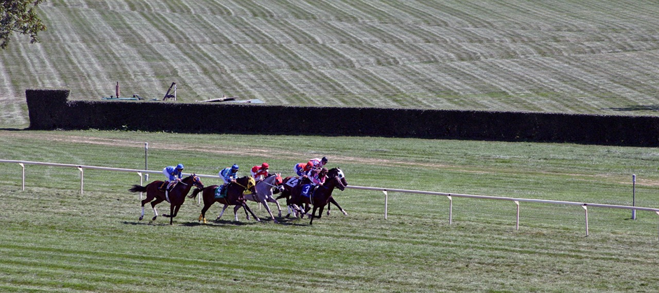
Colors play a significant role in logo design. For horse racing, consider using colors that evoke the spirit of the sport. You can use colors to show different things in your horse racing logo. For example, browns and greens can make people think of nature, like the ground and the grass where the horses run.

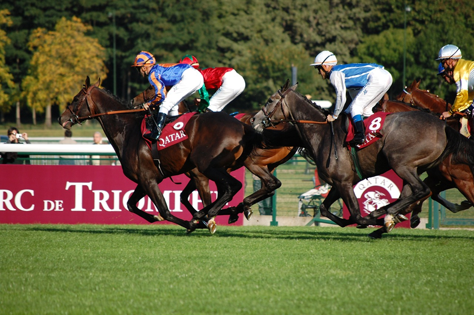
On the other hand, bright colors like red and blue can make people feel the excitement and fast speed of horse racing. Ensure that your chosen colors are visually appealing and harmonize well together.
Incorporate Horse Imagery
Including a horse or elements related to horses in your logo is a common practice in horse racing branding. A stylized horse silhouette, a jockey on a horse, or a horseshoe can be excellent choices. Make sure the horse imagery aligns with your brand identity and the message you want to convey.
Typography Matters
Selecting the right typography is crucial for readability and aesthetics. Consider fonts that are elegant, classic, and easy to read. Avoid overly decorative or complicated fonts that can make your logo hard to understand.
Keep It Simple
Simplicity is key to a memorable logo. Avoid clutter and excessive details that can overwhelm viewers. A simple, clean design is more likely to be recognized and remembered.
Versatility Is Essential
Your logo should look good in various sizes and formats, from large banners to small social media profile pictures. Test your logo in different applications to ensure it remains effective and legible.
Seek Professional Help
If you’re not sure about design, you can ask a professional graphic designer for help. They know how to create logos. They can bring your vision to life and ensure your logo meets industry standards.
Feedback and Iteration
Don’t be afraid to seek feedback from colleagues, friends, or potential customers.

Constructive criticism can help you refine your logo and make it even better. Be open to making necessary changes and iterations based on feedback.
Trademark and Copyright Considerations
Before finalizing your logo, check for trademark and copyright issues. Ensure that your design is unique and doesn’t infringe on the intellectual property of others.
Conclusion
To make a good horse racing logo, you need to really know the sport, have a clear idea of what your brand is about, make smart design decisions, and show what horse racing is all about. If you do these things well, your logo will be memorable and show people what you’re all about.

