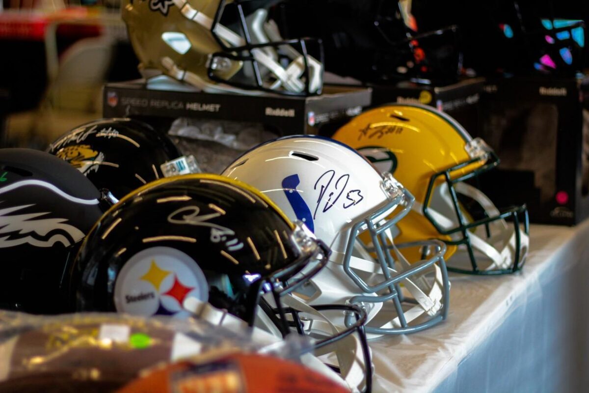
When it comes to sports logos and crests, it is sometimes difficult to get an objective view. At the very core of sports is partisanship and even the most balanced creative professional can quickly become biased and subjective if his or her team – or, more importantly – the team’s biggest rival is mentioned. Asking a Philadelphia Eagles fan about the positives of the New York Giants logo is going to be a tough assignment, for example.
So, while we are going to take a look at some of the best current logos in the NFL, we already know that many of you will have strong opinions either way, depending on your own allegiances. That’s ok. But we are going to be as objective about this as possible.
Sports logos are quite often just accepted for what they are. Journalists will tend to concentrate on the actual sports, while at sportsbettingsites.com the talk will be about betting on sports rather than the aesthetics of the design of the logos of the teams involved. But, taking all sports fandom out of the equation, here are some of the best NFL logos – in our opinion!
Dallas Cowboys
Oftentimes with a sports logo, the brilliance is in the simplicity. It is noticeable that when teams update their logos, the newer design is usually simpler than the more elaborate ones of the past. That’s because the organization is usually thinking about merchandise and apparel sales.
But Dallas got its logo right almost immediately. The Cowboys like to think of themselves as “America’s Team”. But the lone star on their helmet really conveys a message that they are the team of Texas. The extra white and blue border was added just four years after the team was formed and makes the star stand out even more. This logo is just about perfect.
Chicago Bears
In Major League Baseball, almost every team has a stylized version of its initial letter (or letters) as its logo. But in the NFL, it is more often that the nickname is the subject. Not with the Chicago Bears, though. The simple letter “C”, written in a wishbone style, looks just right.
Chicago brought in a plain white version of the current logo in the early 1960s when NFL teams first began to feature them on the helmets of the players. Orange and blue colorways were introduced in 1974 to great effect. An image of a bear is actually the primary logo of the team these days, but the “C” is still the only one that gets to be on the helmet.
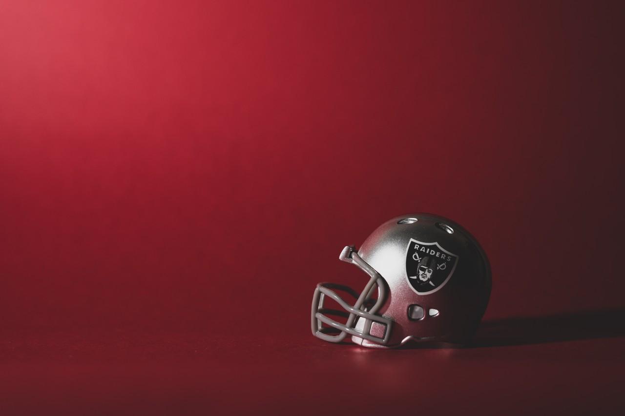
Las Vegas Raiders
The Raiders have moved about a little since their formation in 1960. Los Angeles and Oakland (twice) have been home in the past before the current location of Las Vegas. But the iconic logo has stayed pretty much the same as the team, which has travelled around California and now Nevada.
To be honest, it is a little difficult to understand what is going on with the Raiders logo. At the center is a player in an old-style helmet who is wearing an eye patch. Two pirate-style cutlasses cross behind him – and the whole thing is placed on a shield. Whatever the imagery actually means, it works. The logo conveys the ruggedness and defiant attitude that the Raiders have always had, and it is to the organization’s credit that it never thought of updating as it relocated.
Green Bay Packers
It should come as no surprise that many of the best logos in the NFL are owned by teams that have not felt the need to update much over the years. Green Bay took its name from the packing company that paid for its original jerseys and equipment back in 1919. However, the strong and simple “G” was created in 1961 with the introduction of logos on helmets.
Very little has changed since the “G” was first brought in. The only addition has been the yellow ring around the logo – and that was back in 1980. The two colors make for one of the most distinctive uniforms in the NFL, and the logo sets it off perfectly. Although it in no way looks dated, the Green Bay logo is unashamedly from a simpler time and plays on the nostalgic nature of sports fans.
Miami Dolphins
There should be a rule that every sports team in Miami always has to play in aqua and orange. The colorways just sum up South Florida perfectly and bring a ray of sunshine into the dark days of the NFL winter. The Dolphins logo also seems to perfectly evoke the sunshine and beaches of the city.
Although we are big fans of the current version of the logo that has a Dolphin leaping through the air in front of a sunburst, we would love to see the original design brought back. There is very little difference, to be fair. But the image of a dolphin – wearing a football helmet – is perfect and was only retired as recently as 2012.
Pittsburgh Steelers
Pittsburgh is a city that leans on its yellow and black color scheme to great effect for all of its sports teams. But the Steelers logo introduces other colors that somehow work with the existing palette. Making the logo stand out yet further, the Steelers are the only team in the league that has it on just one side of the helmet.
The name of the team is understandably blue-collar and the logo is actually lifted from the official US Steel steelmark. The colors represent coal, iron ore, and steel and the team was granted permission to add “ers” to the original “Steel” in 1963. Now, the logo seems to represent the strength of the city and the team and remains one of the most recognizable in the league.