
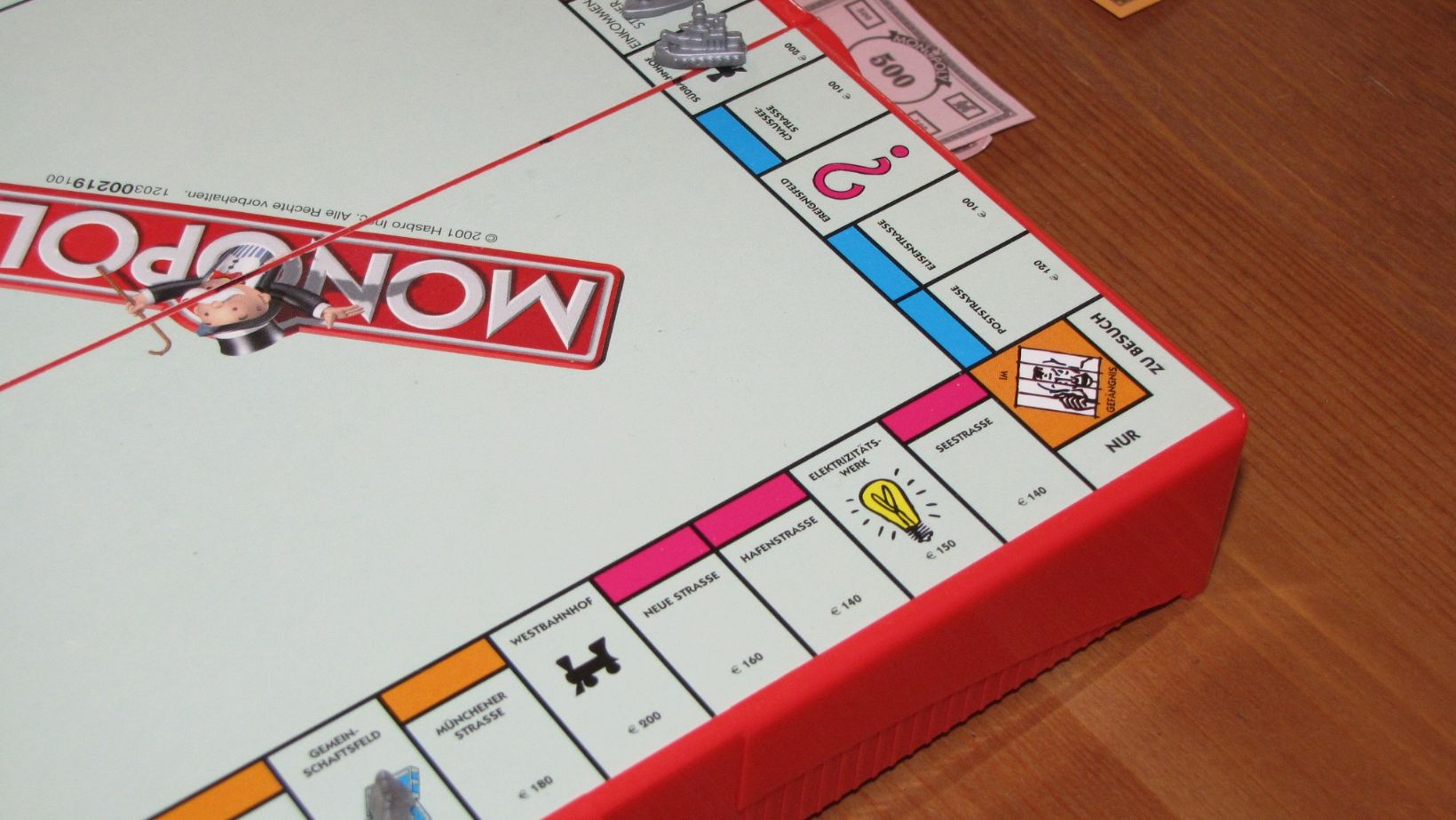
Monopoly Board Game Logo
The Monopoly board game logo holds significant importance in the world of gaming and branding. As a passionate fan of the game, I’ve always been intrigued by the power and recognition that the logo carries. It’s not just a simple design; it represents an iconic symbol that has stood the test of time.
When we think about Monopoly, one of the first things that comes to mind is its logo – the bold red text on a bright yellow background. This visual identity instantly grabs our attention and evokes feelings of nostalgia and excitement. The logo acts as a visual cue, signaling to players that they are about to embark on a thrilling journey through real estate domination.
Beyond its aesthetic appeal, the Monopoly logo plays a crucial role in establishing brand recognition and loyalty. It serves as an anchor point for consumers, reminding them of their favorite childhood memories or exciting game nights with friends and family. By consistently using this recognizable symbol across various platforms, from packaging to advertising, Hasbro (the company behind Monopoly) has successfully built a strong brand presence in the gaming industry.
In conclusion, it’s clear that the importance of the Monopoly board game logo cannot be underestimated. Its iconic design captures our attention and ignites our passion for playing. Moreover, it serves as a powerful tool for branding purposes, creating lasting impressions in consumers’ minds. So next time you see that familiar red text on yellow background, remember how much impact such a seemingly simple logo can have on our gaming experiences.
History of the Monopoly Board Game Logo
The evolution of the Monopoly board game logo is a fascinating journey through time. From its humble beginnings to becoming an iconic symbol of one of the most popular games in history, the logo has played a significant role in shaping the identity and recognition of Monopoly.
- The Early Years: In the early years of Monopoly’s existence, which dates back to the early 20th century, there was no standardized logo for the game. Different versions featured various designs and typography, reflecting the aesthetic preferences of different publishers. However, one element that remained consistent was the use of “Monopoly” as part of the logo, often accompanied by illustrations related to wealth and property.
- The Classic Logo: It wasn’t until 1935 when Parker Brothers acquired the rights to produce Monopoly that a more unified and recognizable logo emerged. This classic logo featured bold lettering with thick outlines and a distinctive font style that exuded a sense of elegance and sophistication. The word “Monopoly” dominated the center, surrounded by decorative elements such as ribbons or banners.
- Evolution over Time: As Monopoly gained popularity worldwide, its logo underwent several refinements while maintaining its core design elements. In some editions released during later decades, subtle modifications were made to enhance legibility or incorporate cultural references relevant to specific regions or countries.
- Modern Adaptations: In recent years, as technology advanced and new editions were introduced, we witnessed modern adaptations of the iconic Monopoly board game logo. These variations incorporated contemporary design trends while preserving key elements that have become synonymous with Monopoly’s brand identity.
- Enduring Recognition: Today, regardless of whether you’re playing on a physical board or indulging in digital versions on your smartphone or computer screen, there’s no mistaking that familiar Monopoly logo – an emblem associated with strategy, negotiation skills, and hours upon hours spent in the pursuit of property domination.
Evolution of the Monopoly Board Game Logo
The Monopoly board game has captured the hearts and minds of players for decades, and one key element that has contributed to its enduring success is its logo. Over the years, the Monopoly logo has evolved, reflecting changes in design trends and capturing the essence of this iconic game.
- Classic Beginnings: When Monopoly was first introduced in 1935, its logo featured a simple yet distinctive design. The word “Monopoly” was written in bold capital letters with a rounded font, evoking a sense of elegance and sophistication. This classic logo became synonymous with the game itself and laid the foundation for future iterations.
- Adaptation to Modern Times: As time went on, Monopoly continued to evolve along with popular culture and design aesthetics. In response to changing trends, the logo underwent subtle modifications while maintaining its core elements. The font became more streamlined and contemporary, blending tradition with modernity.
- Branding Consistency: One notable aspect of the evolution of the Monopoly logo is its consistency across different editions of the game. Whether it’s the original version or special editions themed around cities or movies, you’ll find that each edition retains key elements from the classic logo while incorporating unique touches that reflect its specific theme.
- Iconic Symbolism: The current iteration of the Monopoly logo features a stylized top hat perched atop one corner—a symbol that represents wealth and success within the game itself. This addition further reinforces both brand recognition and association with what makes Monopoly so captivating: financial strategy and ambition.
- Cultural Impact: Beyond mere aesthetic changes, it’s essential to acknowledge how these variations in logos have impacted popular culture over time. The image of Mr.Monopoly (or Rich Uncle Pennybags) associated with these logos has become an instantly recognizable figure worldwide—an embodiment of capitalism and strategic gameplay.