
As a passionate gamer, I’ve always been captivated by the iconic logos of video game franchises. One logo that has stood the test of time and remains instantly recognizable is the Sonic game logo. From its inception in 1991 to the present day, this emblem continues to evoke a sense of nostalgia for gamers around the world.
The Sonic game logo features a sleek, bold design that perfectly encapsulates the speed and energy synonymous with the beloved hedgehog character. Its vibrant blue color scheme, accompanied by sharp angles and dynamic lettering, creates a visually striking image that leaves a lasting impression on fans.
Over the years, this logo has undergone subtle modifications while retaining its core elements. From slight tweaks in font styles to incorporating additional graphics, each iteration has aimed to capture Sonic’s enduring appeal while keeping up with contemporary design trends. Whether it’s emblazoned on game covers or merchandise, the Sonic game logo remains an iconic symbol of adventure and excitement for gamers young and old.
Sonic Game Logo
When it comes to iconic video game characters, Sonic the Hedgehog is undoubtedly a name that springs to mind. Throughout his long and illustrious history, one aspect that has evolved alongside him is his game logo. In its early iterations, the Sonic game logo underwent several changes as developers sought to capture the essence of this speedy blue hedgehog.
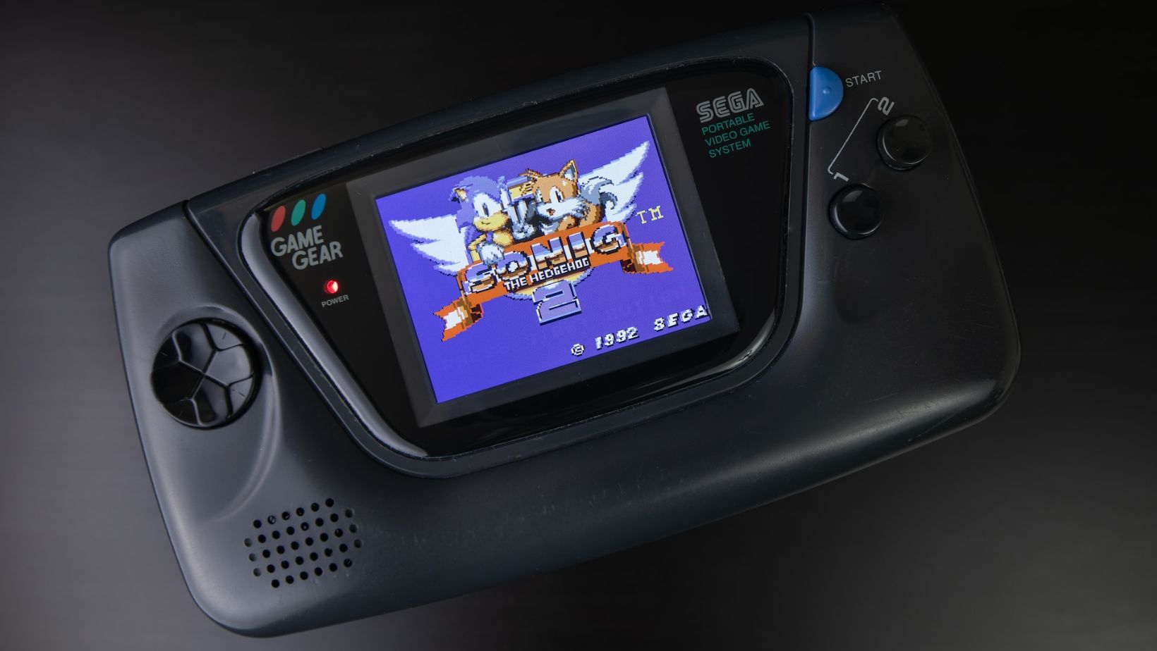
Back in 1991, when Sonic made his debut on the Sega Genesis console with “Sonic the Hedgehog,” the logo was relatively simple yet vibrant. The letters were bold and outlined in white, showcasing an energetic and dynamic design that mirrored Sonic’s personality. As subsequent games were released, minor tweaks were made to enhance readability or incorporate thematic elements.
The Iconic Design Elements of the Sonic Game Logo
Over time, certain design elements became synonymous with the Sonic game logo. One such element is undoubtedly the use of a stylized font that exudes speed and movement. The letters are sleek and slanted, resembling a sense of forward momentum that perfectly aligns with Sonic’s lightning-fast nature.
Another iconic feature is the incorporation of bright colors like blue and yellow into the logo. These hues not only reflect Sonic’s trademark blue fur but also evoke a sense of energy and excitement commonly associated with his adventures. Together with unique typography choices, these design elements have helped establish a visual identity for the franchise.
The Colors Used in the Sonic Game Logo
When it comes to the iconic Sonic game logo, one cannot help but be drawn to its vibrant and energetic color palette. The primary colors used in the logo are blue and white, with additional accents of yellow and red. These bold color choices perfectly capture the essence of Sonic’s speedy nature and create a visually striking brand identity.
The use of blue as the dominant color in the Sonic game logo is no coincidence. Blue has long been associated with feelings of trust, reliability, and calmness. By incorporating this hue into their design, Sega (the creators of Sonic) effectively communicates that players can rely on Sonic to deliver thrilling adventures while maintaining a sense of dependability.
In contrast, the pops of yellow and red in the logo add an element of excitement and energy. Yellow is often linked to happiness, optimism, and creativity, which aligns perfectly with the joyful experience gamers have when playing Sonic games. Red, on the other hand, symbolizes passion, speed, and determination – characteristics that resonate strongly with Sonic’s adventurous spirit.
Typography Choices in the Sonic Game Logo
Typography plays a crucial role in shaping a brand’s identity, and Sega carefully selected fonts that convey both playfulness and dynamism for their iconic hedgehog character.
The main font used for “Sonic” is a modified version of Helvetica Bold. This choice reflects simplicity while still exuding strength through its bold weight. The clean letterforms contribute to legibility at various sizes across different platforms such as video games or merchandise.
In conclusion, when comparing the Sonic Game logo with other gaming logos, it becomes evident that it stands out in terms of recognizability, simplicity, timelessness, brand personality, and impactfulness. It has become an iconic symbol in the gaming industry and continues to resonate with gamers worldwide. Whether you’re a fan of Sonic or not, there’s no denying the power and appeal of this legendary logo.