As an entrepreneur, you need to recognize that coming to market with a new and unique product or service is not enough. You have to be able to sell that product or service. That’s where the marketing game begins.
If you want consumers to see and recognize your company, you must create a brand. Better yet, you need to create a catchy brand that stirs the imagination and differentiates your company from tens of millions of companies doing business all over the world. A strong brand can also Enhance Productivity & Integration within your organization, ensuring consistent messaging and seamless communication.
How important is branding? Your brand will likely follow your company in perpetuity. It will tell current and prospective customers things about your company that you can’t put into words. In fact, some of the most iconic brands have stood the test of time for over a century.
Building a Brand
Before you can proceed to build a brand that will stand the test of time, it would help to know how to differentiate between three (3) key terms: Brand, branding, and brand identity.
Your brand will evolve to be how people perceive your company’s image in the marketplace. Branding is the steps you take to create that image. The brand identity is the culmination of branding efforts into the creation of one standing image.
Breaking Down The Logo Design Process
The one brand identifier that will help create brand recognition is your logo. Of course, your logo is going to be but a small piece of the brand-building process. However, it’s always a good place to start because consumers tend to be visual creatures. By nature, we are tantalized by shapes, sizes, and colors.
It’s crucial that you create the perfect logo. Why? Your logo is going to serve as the gateway towards the rest of the brand-building process. If you miss the mark, the brand could suffer.
Let’s go through the process of creating a logo. We’ll break it down into six (6) steps.
Understand the need for a logo
Your goal is to attract customers who might not otherwise know anything about your company. With a focus on making a good first impression, you want your logo to say good things about the company, creating a desire among consumers to look under the hood.

Creating brand identity
One symbol, your brand, will have to carry the burden of telling consumers about your company’s core personality and that for which the company stands.
Finding the inspiration for your logo
You’ll have to invest a lot of time in this area. It will take a bit of brainstorming, visualizing, testing, discussing, and contemplating. However, you have to put the work in if you want to create the perfect logo to represent you and your company.
Peek at the competition
If you look at the logos of your main competitors, you can learn a lot of useful information. You can learn what works and doesn’t work with consumers in your space. You can also get indications of how to differentiate your logo without straying too far from what seems to be working.
Creating the logo design
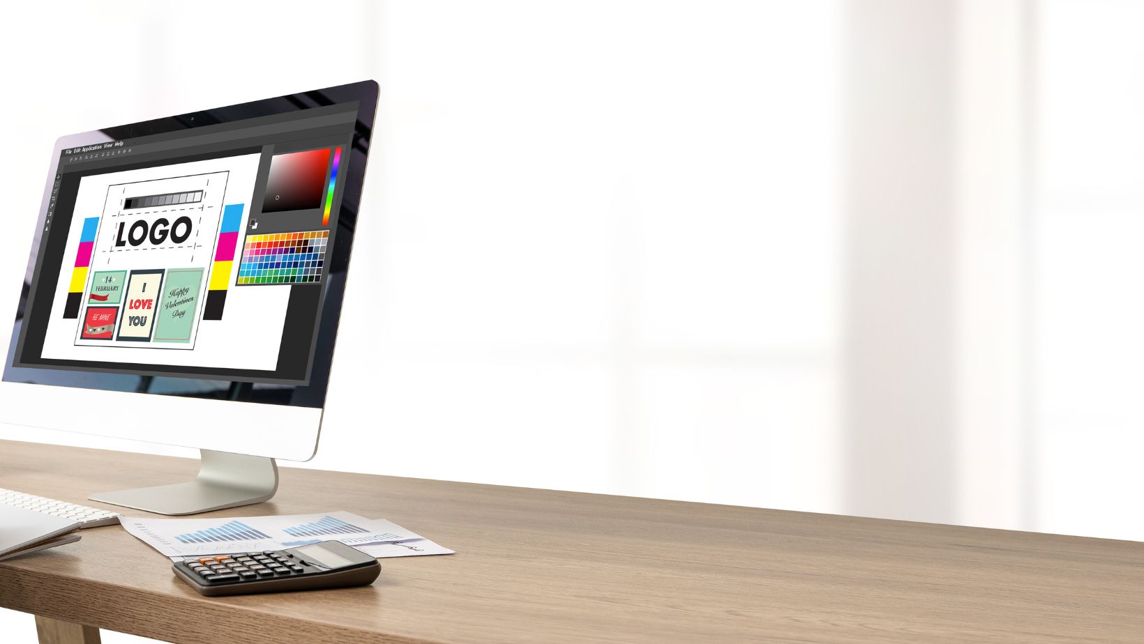
Hopefully, going through the first four steps has brought you to the point of visualizing what you want your logo to look like. Now is the time to start turning thoughts into an actual design. The key components of the logo design process will be:
- Choosing the right type of logo – up to 7 options
- Selecting logo colors – helpful to study theory
- Picking the right typography or fonts – 4 basic choices

Create Multiple Designs
Before you settle on one logo, you’ll likely end up creating multiple variations. That is to be expected as you hone in on that ends up standing above the rest.
Case Study – Crypto Logos
When you look out on the crypto community, you’ll immediately recognize the space is filled with dozens of major players and tens of thousands of wannabes. Let’s compare the logos of the two most prominent cryptocurrencies: Bitcoin and Ethereum.
Keeping in mind that we are looking at players in the financial sector, one would expect that the logos would want to elicit both trust and confidence from consumers. This is especially true since cryptos are becoming more accepted from places like Starbucks to online casinos.
Bitcoin’s logo looks like a gold coin stamped with a B that is made to look like a dollar sign ($). The logo screams prestige, which seems appropriate for the most widely held and traded coin in the marketplace. The gold color is a nice touch given that Bitcoin is often considered the gold standard of cryptocurrencies.
The Ethereum logo was created, using a nice variety of pastel colors. While it doesn’t necessarily scream of being a company logo from part of the financial sector, it does create a sense of trust.
Using this case study, it’s easy to see how logos are intended to convey messages without words.

