
With the next Bitcoin halving date approaching, the hype around the largest cryptocurrency steadily rises. And while the value of bitcoin continues to hit the news, the iconic orange “B” logo takes on a whole new level of significance.
To say neglecting Bitcoin’s influence on the cryptocurrency market would be an understatement is absolutely right. Bitcoin has proven to be the driving force behind the crypto success. When the price of BTC surges, as it is nowadays, we often see a ripple effect across other cryptocurrencies, causing their price to rise as well.
This is why countless enthusiasts explore how to buy Dai and other altcoins, hoping to capitalize on favorable market opportunities.
In this article, we won’t discuss the latest market events. Instead, we’ll switch our focus away from investing for a bit, and explore what’s behind the Bitcoin logo. Sit back and relax as we unravel the secrets you’ve never heard before.
Mystery Origins
The exact origin of the Bitcoin logo remains somewhat a mystery to many. While most corporate logos come with documented design process, typically available to the broader public, the logo of the largest cryptocurrency originally merged for the early online Bitcoin forums.
In 2009, Satoshi Nakamoto (or people behind this pseudonym), also known as the creator of Bitcoin, posted a link to a forum thread where various logo ideas were being tossed around.
Some of the adaptations included the existing currency symbols like the dollar sign ($). Others incorporated golden bars or futuristic-looking illustrations of an individual interacting with a computer.
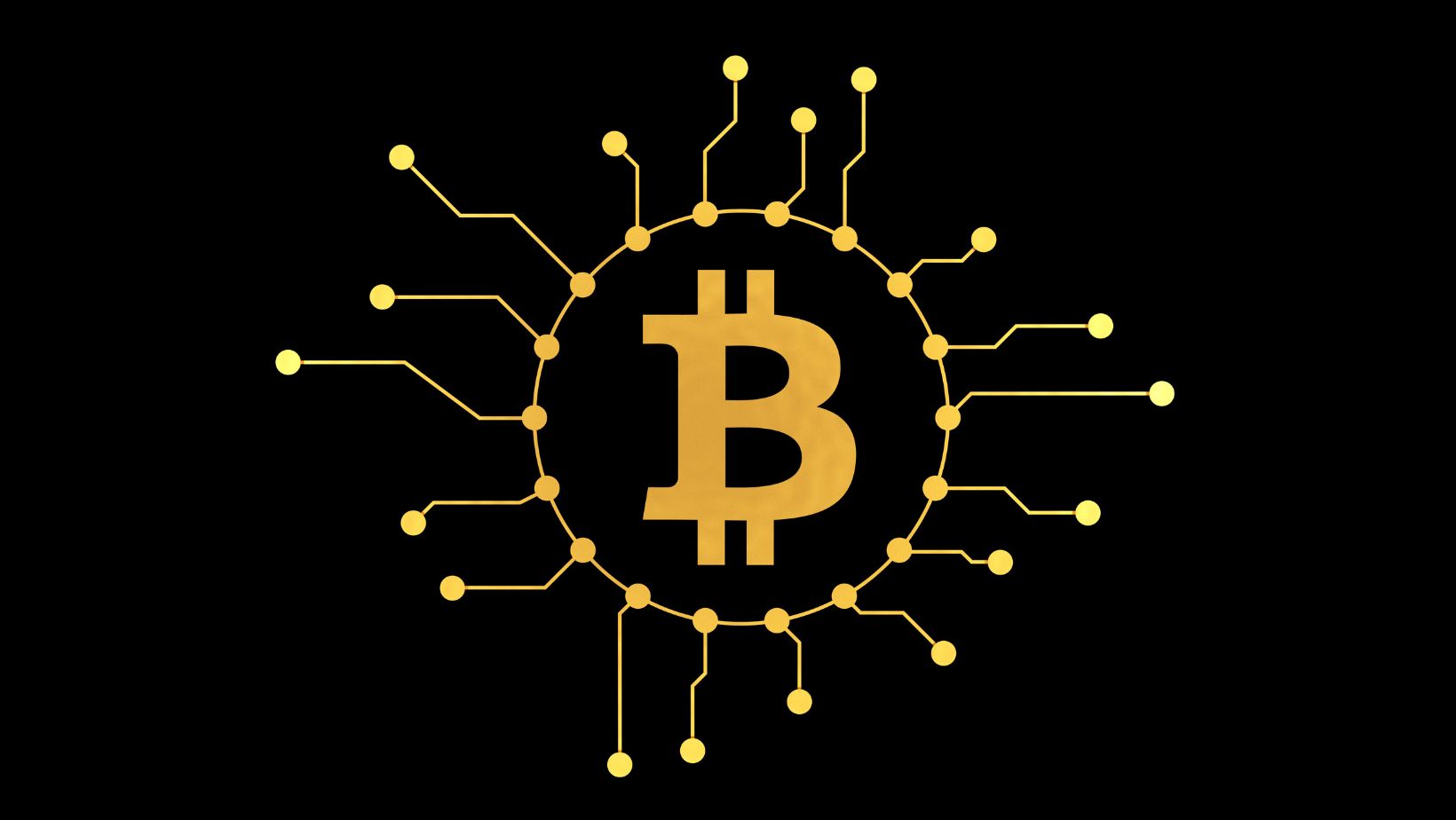
However, the design that ultimately gained traction was a seemingly simple, orange “B” with two vertical bars cutting through the middle of the sign.
Theories and Symbols
The designer’s inspiration behind the logo remains unconfirmed to this day. However, several theories have emerged over the past few years, with some being more or less creative.
Some enthusiasts believe the two vertical bars represent the equal sign (=), which could signify Bitcoin’s role as a peer-to-peer payment system, where transactions happen directly between users without a central authority (banks or other financial institutions).
Others suggest the design represents a traditional gold coin, with the two bars acting as parting lines on a minted coin. This theory links Bitcoin to the concept of sound money, a store value traditionally associated with precious metals like gold and silver.
What about the color? Well, this is also open to interpretation. Some enthusiasts suggest it evokes a sense of value and scarcity (bear in mind BTC is capped at 21 million) similar to the color of gold. Again, others propose the orange color is only a coincidence, and was picked simply because it’s a visually appealing choice that stands out well in digital spaces.
Symbol of Decentralization
Even the lack of a definitive origin story couldn’t prevent the Bitcoin logo from becoming a symbol of the entire cryptocurrency movement. It’s simple; it’s clean; it’s easily recognizable. As such, the logo of the most valuable cryptocurrency became the perfect fit for websites, social media profiles, and merchandise, acting as a rallying point for countless Bitcoin enthusiasts worldwide.
Design aside, did you know that the logo of Bitcoin belongs to no single entity? Here comes the mind blowing part – the decentralized nature of Bitcoin is also reflected in the logo’s ownership. This means that anyone can use and modify it freely, which further emphasizes the open-source and permissionless nature of the cryptocurrency itself.
Adoption Beyond Bitcoin
While the price of bitcoin continues to experience dramatic swings in value, one remains constant – its visual representation. We can even go so far as to say that the logo serves as a reminder of the core principles of decentralization and financial innovation, even during periods of significant market turbulence.
Conclusion
The Bitcoin logo transcended its original purpose and became a powerful symbol and cultural icon that embodies the spirit of a revolutionary and decentralized movement. Its origins may be a mystery, but its impact is undeniable and can not be neglected.
Its simplicity makes the logo instantly recognizable.

The very appearance of an orange “B” sign often sparks discussions about the future of money, the role of central banks, and the potential for a more inclusive landscape, even among the Doubting Thomases.