
Why This Part Was Harder Than I Expected
When I started working on my logo for a small homemade soap business, I thought picking colors and fonts would be the fun and easy part. I was wrong.
Once I opened the design editor, I froze. There were hundreds of font options, dozens of color combinations, and I had no idea what would actually work. I tried mixing trendy pastels with bold serif fonts, then switched to black-and-white minimalism — only to find that nothing looked quite right.
That’s when I realized: choosing colors and fonts isn’t just about what looks pretty. It’s about communicating a message. My brand was meant to feel clean, calming, and natural — but the way I was designing didn’t say that. So I decided to pause and rethink the process. That shift made all the difference.
What Helped Me Find the Right Direction
Starting with the Brand Mood
I went back to the basics and asked myself:
- What emotions do I want my brand to evoke?
- What kind of customer am I trying to attract?
My soaps were made with essential oils, zero plastic packaging, and soft natural scents — so I wanted my brand to feel gentle, eco-friendly, and a little bit rustic. That helped narrow down the choices immediately.
Warm earth tones started making more sense than bold neon colors. Fonts with soft edges felt more welcoming than sharp, futuristic ones. Getting clear on my brand vibe was the first real breakthrough.
Exploring Color Palettes With Purpose
Once I had a direction, I started testing combinations. I didn’t want to overwhelm myself with a full rainbow, so I chose a main color and one accent. I used muted greens and beige — colors that felt close to nature but still clean and readable.
To test these, I applied them to basic mockups:
- Product labels
- My website background
- A small icon for Instagram
In some versions, the colors looked perfect on screen but washed out in print. That’s when I learned about contrast and readability. For example, a pale green looked nice but was hard to read on a light background — so I darkened it slightly and added a stronger contrast for text.
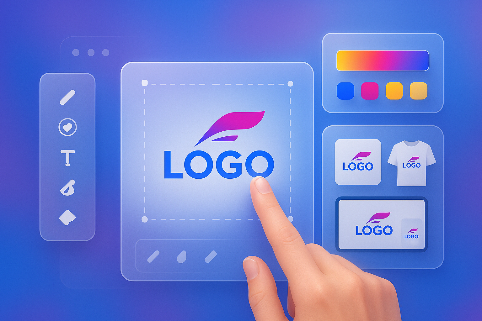
Using a smart and supportive tool helped too. When I tried out Turbologo, it offered color suggestions that matched the tone I described — and helped keep the combinations balanced, even though I had no formal design knowledge.
Picking a Font That Matched the Message
Fonts were even trickier. I tried several modern ones that looked trendy but didn’t feel quite right. Some were too sharp, others too playful.
Eventually, I realized I was treating fonts like decorations instead of voices. The right font should “speak” in the tone your brand needs — formal, friendly, bold, or relaxed.
I settled on a round, sans-serif font that was easy to read but still felt soft and inviting. I also checked how it looked in uppercase, lowercase, and when placed next to my icon. That step is easy to miss, but it makes a huge difference in how professional the logo feels.
Testing Combinations in Real Context
One of the best things I did was test my colors and fonts together in different places. I mocked up a website header, printed a small label, and previewed the logo on a mobile screen.
That’s when I saw issues like:
- Text disappearing on small sizes
- Color blending into the background
- Font weight feeling too light for product packaging
I made small adjustments — thicker font weights, slight color shifts — and it all started coming together. I even ran a quick experiment using an AI logo maker, just to see how other tools approached the same idea. It gave me a fresh perspective and a few ideas I wouldn’t have come up with on my own.
What I Learned and What You Can Try Too
Think brand first, not just style
If you don’t know what your brand stands for, choosing colors and fonts will feel random. Take time to define how you want people to feel when they see your brand.
Limit your color palette
Too many colors can make your logo look chaotic. Stick with 1–2 main colors and test them on both light and dark backgrounds.
Test for readability
What looks nice in a preview might be hard to read in real life. Check your logo at different sizes and across devices. Always prioritize clarity.
Let fonts do the talking
Fonts carry emotion. A clean sans-serif feels different from an elegant script. Choose the one that fits your message, not just what’s trending.
Use beginner-friendly tools
Designing your own logo can be fun — especially if the tool helps guide you instead of overwhelming you. I found that Turbologo made it easier to stay consistent and clear, even as a first-timer.
A Small Design Choice That Made a Big Impact
Looking back, figuring out my colors and fonts wasn’t just about making things look good. It helped me understand my brand better — and communicate that to others. Every time I see my logo now — on packaging, online, even on customer photos — I feel proud.
It reminds me that great branding doesn’t have to be complicated or expensive. With a little patience and a few thoughtful decisions, even beginners can create something that feels truly “them.”
So if you’re at this stage now, don’t stress. Start with what your brand feels like, and let your choices grow from there. You might be surprised at how quickly it all starts to make sense.