How to Draw Iconography
If you’ve ever found yourself scrolling through an app or website, captivated by the simple yet powerful visual elements guiding your journey, you’ve experienced the magic of iconography. Iconography, in its essence, is a visual language used to represent functionality or content. It’s a critical component of successful user interface (UI) design and can make or break the user experience (UX).
I’ve spent years refining my skills as a graphic designer, and I’m here to share my insights on how to draw iconography that communicates effectively and enhances any digital platform. Let’s dispel the myth that creating icons is challenging – with a clear understanding and some practice, anyone can create engaging icons.
Creating effective iconography doesn’t require fancy software or innate artistic talent. What it does demand is careful thought about what you’re trying to communicate and meticulous attention to detail. So let’s dive in, get our hands dirty, and explore how we can elevate our UI designs with well-crafted icons!
Understanding The Basics of Iconography
Diving headfirst into the world of iconography can feel like a daunting task, but it’s not as complex as you might think. Let’s break it down together.
Starting Out: Fundamentals of Drawing Iconography
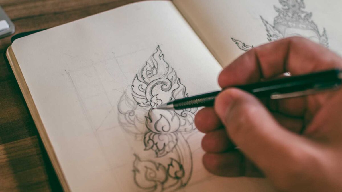
Iconography isn’t just about drawing pretty symbols. It’s about conveying meaning in the simplest way possible. I always start by sketching my ideas on paper before digitizing them. This gives me the freedom to play around with different shapes and sizes without worrying about pixels or vectors quite yet.
A few key principles guide my design process:
- Simplicity: The best icons are easy to understand at a glance.
- Consistency: Uniformity across your icons helps users recognize them faster.
- Versatility: Your icons should work well in various contexts and sizes.
Remember, practice makes perfect! Don’t get discouraged if your first few attempts don’t look perfect.
Tips And Techniques For Creating Effective Iconography
Drawing effective iconography is an art form that requires precision and thoughtfulness. Here are some tips that have helped me over the years:
- Keep your designs simple and clear
- Use common symbols that people will instantly recognize
- Make sure your icons look good at both small and large scales
- Use consistent line weights for all your icons to maintain uniformity
Remember how important it is to iterate often – this means making small changes, testing them out, seeing what works, then refining based on feedback.
Enhancing Your Iconography: Tools and Resources
Getting comfortable with digital tools can take time but it’s absolutely worth it! Adobe Illustrator has been my go-to tool for creating vector-based iconographies due to its versatility.
Here are few resources I’ve found valuable in honing my skills:
- Online Tutorials: Websites like Skillshare or Udemy offer comprehensive lessons on icon design.
- Design Blogs: Sites like Dribbble or Behance can provide a wealth of inspiration.
- Books: “The Noun Project” is a fantastic book that delves into the theory and practice of icon design.
Remember, no one becomes an expert overnight. So keep exploring, experimenting, and learning!
Materials Needed to Draw Iconography
Before we dive into the actual process of drawing iconography, let’s talk about the materials you’ll need. Having the right tools at your disposal can make a significant difference in your work quality and ease.
First off, you’ll need high-quality pencils. I recommend using graphite pencils for initial sketches as they’re easy to erase and adjust. Typically, an assortment of hard (H) and soft (B) pencils will give you a good range to work with.
Next on our list is paper. It’s essential that you use heavyweight paper or illustration board for iconography as lighter weight papers can warp or tear easily under rigorous shading or erasing.
Here are some additional materials you might find helpful:
- Erasers: A kneaded eraser is great for lightening lines or removing small details.
- Ink pens: These are used for final outlines and detail work after initial sketching is complete.
- Ruler or Straightedge: This helps in creating straight lines and precise measurements.
- Sharpener: To keep your pencils sharp and ready!
Lastly, don’t forget a comfortable workspace! Having enough room to spread out and organize your materials makes a huge difference in both productivity and enjoyment. Now that we’ve covered what you’ll need, let’s get started on learning how to draw iconography!