Which of the Following Colors Suggests Neutrality?
When it comes to colors and their associated meanings, one hue stands out for its neutrality – gray. It’s a color that often gets overlooked, relegated to the background in favor of more vibrant shades. However, gray holds a unique position in the color spectrum that’s worth exploring.
As an individual who has spent countless hours studying and analyzing color theory, I’ve come to appreciate the understated elegance and balance gray brings to design. It’s not as stark or absolute as black or white. Instead, it straddles both extremes, making it the perfect neutral backdrop against which other colors can shine.
Understanding Color Psychology
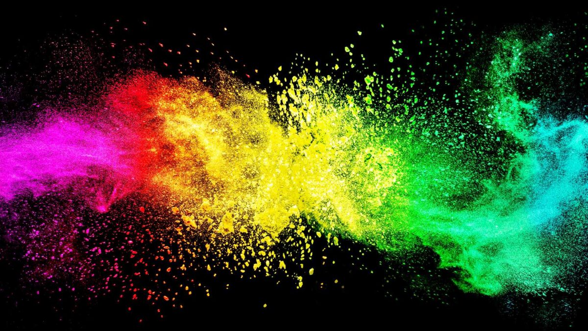
Let’s delve right into the fascinating world of color psychology. Now, you might be wondering what this field is all about. Simply put, it’s the study of how colors influence our behaviors and decisions. A critical aspect we’ll examine today is neutrality in color psychology.
Defining Neutrality in Color Psychology
When we talk about neutral colors, we’re referring to those hues that don’t seem to pop or stand out. Think grays, whites, blacks and even some shades of brown. They’re often termed “non-colors” due to their lack of vibrancy compared to more saturated choices like red or blue. However, that doesn’t make them any less significant! In fact, these quiet players have a powerful role in shaping perceptions and setting moods.
Colors Suggesting Neutrality: A Deep Dive
Among neutral hues, gray is perhaps the most quintessential embodiment of neutrality—neither black nor white but somewhere comfortably in between. It’s often associated with balance and calmness—a safe harbor amidst a sea of more emotionally charged colors.
- White, on the other hand, represents purity and simplicity—it’s clean slate that evokes feelings of freshness and renewal.
- Black can convey sophistication and elegance when used appropriately but also has darker connotations such as heaviness or somberness.
- Brown’s natural earthy tones suggest stability and reliability—an anchor grounding us amidst change.
Each neutral shade carries its own unique message!
Impact of Neutral Colors on Perception
The power behind these understated colors lies within their ability to shape our perceptions subtly yet effectively. For instance:
- Gray could be seen as professional yet unobtrusive—it doesn’t scream for attention but instead fosters an environment conducive for focus.
- White spaces are perceived as being brighter and larger than they actually are which brings lightness into design.
- Black adds depth and power, providing a strong contrast to other colors. It’s often used in luxury branding due to its association with sophistication.
- Brown, with its earthy tones, can evoke feelings of comfort and warmth—instilling trustworthiness in an environment or design.
By understanding how these neutral colors influence perceptions, we can use them strategically in our environments and designs for desired effects. So the next time you’re considering color choices, don’t overlook the neutrals—they’ve got more to say than you might think!
The Concept of Neutrality in Colors
Let’s dive into the fascinating world of color theory. I’ll discuss how neutrality is perceived across different colors and why some hues are considered more neutral than others.
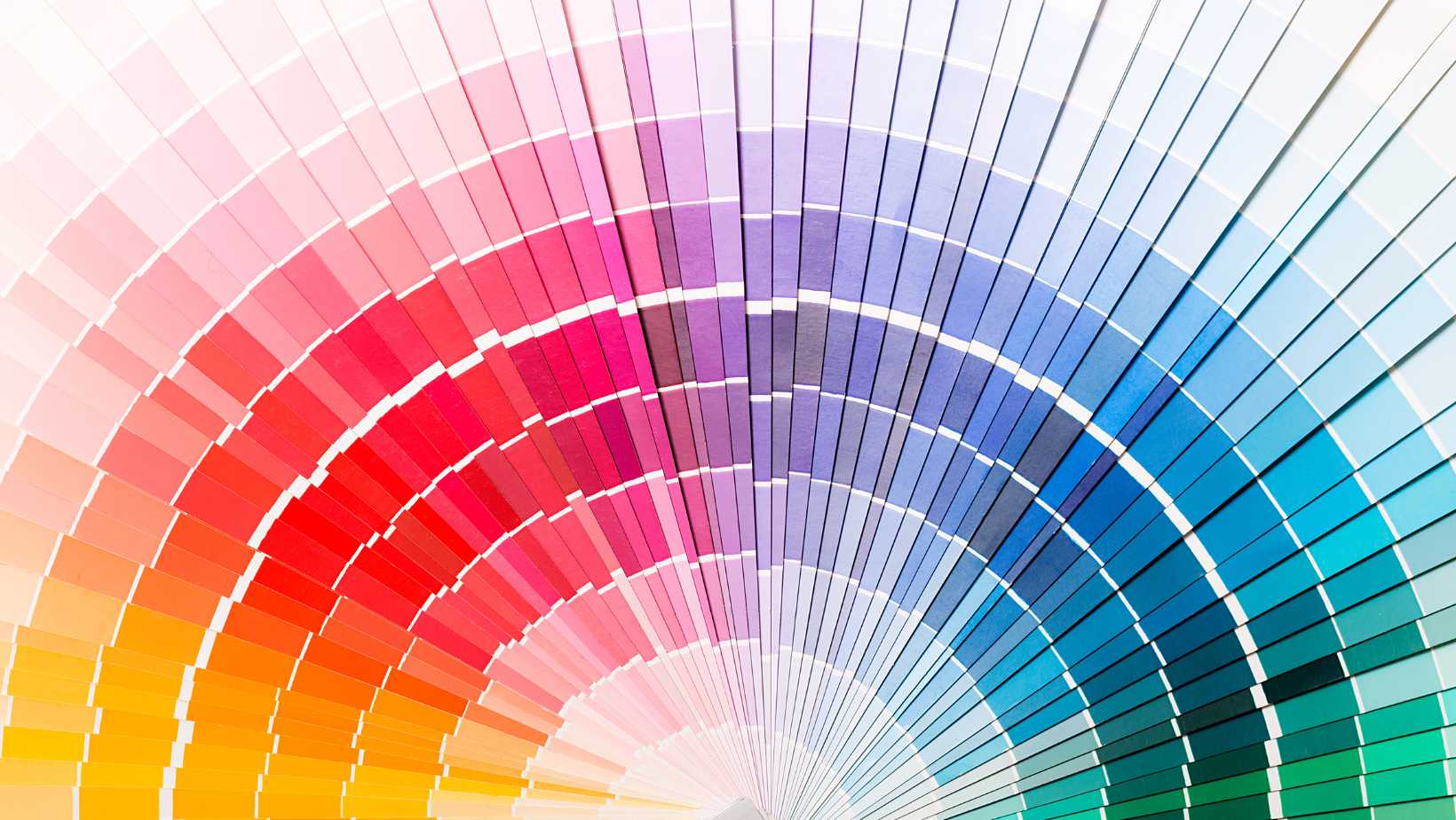
Neutral colors, as you might already know, don’t show up on a typical color wheel. They’re the quiet shades that provide balance to our colorful world – think whites, blacks, grays, and sometimes browns. These colors play an essential role in design and visual art by offering a calm backdrop against which other colors can shine.
The idea of neutrality extends beyond just the realm of visual aesthetics too! In psychology and symbolism, certain colors imply neutrality due to their association with balance and impartiality. For instance:
- White often symbolizes purity and innocence
- Gray tends to represent compromise and control
- Black is associated with power and elegance
Remember though that context matters! The perception of these ‘neutral’ tones can vary based on cultural differences as well as personal experiences.
So there you have it – my take on the concept of neutrality in colors! From design aesthetics to symbolic interpretations, we’ve covered quite a bit today. Next time when someone asks “which color suggests neutrality?”, you’ll not only be able to name them but also explain why!